


Currently, selecting only one topic is often not enough to accurately describe a post. In many cases, a post naturally belongs to multiple topics, and allowing only a single selection makes categorisation less effective.
It would be great if members could assign multiple topics to a post where appropriate. This would improve discoverability, filtering, and search, while ensuring posts appear in all relevant topic feeds.
Examples:
- A post about using AI to generate social media content could be tagged with AI, Marketing, and Content Creation.
- A discussion on CRM automation using email workflows could be tagged with CRM, Automation, and Email Marketing.
- A WordPress plugin update that includes new API endpoints could be tagged with WordPress, Development, and API.
- A community event teaching business networking could be tagged with Events, Networking, and Business Growth.
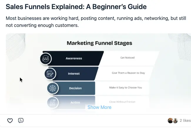
When a post is long enough to display a “Show More” option and has an image at the top, the current behavior creates a poor user experience.
Right now, clicking on the image opens it in a lightbox instead of expanding or opening the article. The only way to view the full post is to click “Show More.”
This is counterintuitive. A user’s first instinct is to click on the post or its image to continue reading, not to look for and click a “Show More” link.
I recommend changing the interaction so that clicking on the featured image expands or opens the full article, rather than opening the image in a lightbox. If users specifically want to view the image, that functionality can be accessed through a separate action.
This is a significant UI/UX issue because it interrupts the natural reading flow and makes the interface feel unintuitive.
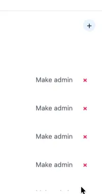
When you go to the Groups , there is a “Make Admin” action displayed next to every user.
I don’t think this is the best user experience. Since making someone an admin is not a frequently used action, it shouldn’t always be visible.
Instead, I suggest moving this action into a three-dot (⋮) overflow menu or a similar “More actions” menu. The “Make Admin” option would only appear after clicking the menu, keeping the interface cleaner and reducing visual clutter.
Alternatively, you could introduce an “Edit Mode.” When Edit Mode is enabled, administrative actions such as “Make Admin” become visible. When Edit Mode is disabled, these actions remain hidden. This would create a cleaner interface while still making admin actions easily accessible when needed.


Hi! I love Fluent Community but it would be great to have the option to upload videos not only embedding them.
I have installed FluentPlayer but only lets you upload one video in each post. Also it would be great to have the option to upload videos and photos at the same time. Now it’s only possible to upload video and embed photos using the / menu.
With this option creat posts with photos and videos would be easier.
Thanks and keep the good work!

🚀 We're exploring our next product for the FluentCommunity ecosystem, and we'd love your feedback.
At IndraSys, we're considering a new Creator Mode plugin designed for communities that want a YouTube Shorts–style experience inside FluentCommunity.
The initial vision includes:
🎥 Vertical Shorts Feed
📱 Full-Screen Swipe Experience
❤️ Like & Comment
👁️ Video View Counter
💰 Creator Wallet
📊 View-Based Earnings (Admin Controlled)
⚙️ Admin Controls for Creator Monetization
The goal is to help community owners build a creator economy inside their own community—not on external social platforms.
We're currently in the planning stage, so we'd love to hear your thoughts.
Would this be valuable for your community? What features would you like to see in the first release?
— Team IndraSys 🌐 https://indrasys.com

Hi everyone,
Has anyone here tried FC Addons with FluentCommunity, especially the PWA and Push Notifications add-ons?
I’m considering buying the Lifetime package for my community and would really appreciate feedback from real users:
- Are the add-ons stable, or do they cause any issues or slow down the website?
- How is the PWA experience on iPhone and Android?
- Do push notifications work reliably?
- Is their support helpful when there is a problem?
- Do you think the Lifetime deal is worth the price?
I’d really appreciate any honest experience or advice before purchasing. Thank you! 🙏

I found that the lessons would not unlock in order...
Bug Location: FluentCommunityPro\App\Hooks\Handlers\SequentialLessonLockHandler::getOrderedLessonIds()
Problem: The query fetching all course lessons only orders by priority (->orderBy('priority', 'ASC')). Because lessons across different sections share the same default priority (e.g., 0), the database sort is unstable and returns lessons in an arbitrary order, mismatching the frontend display order.
Fix: Add a secondary sort by ID to the query so it matches the frontend:
php$rows = CourseLesson::where('space_id', $courseId)
->where('status', 'published')
->orderBy('priority', 'ASC')
->orderBy('id', 'ASC') // <--- Add this line
->get(['id', 'parent_id']);

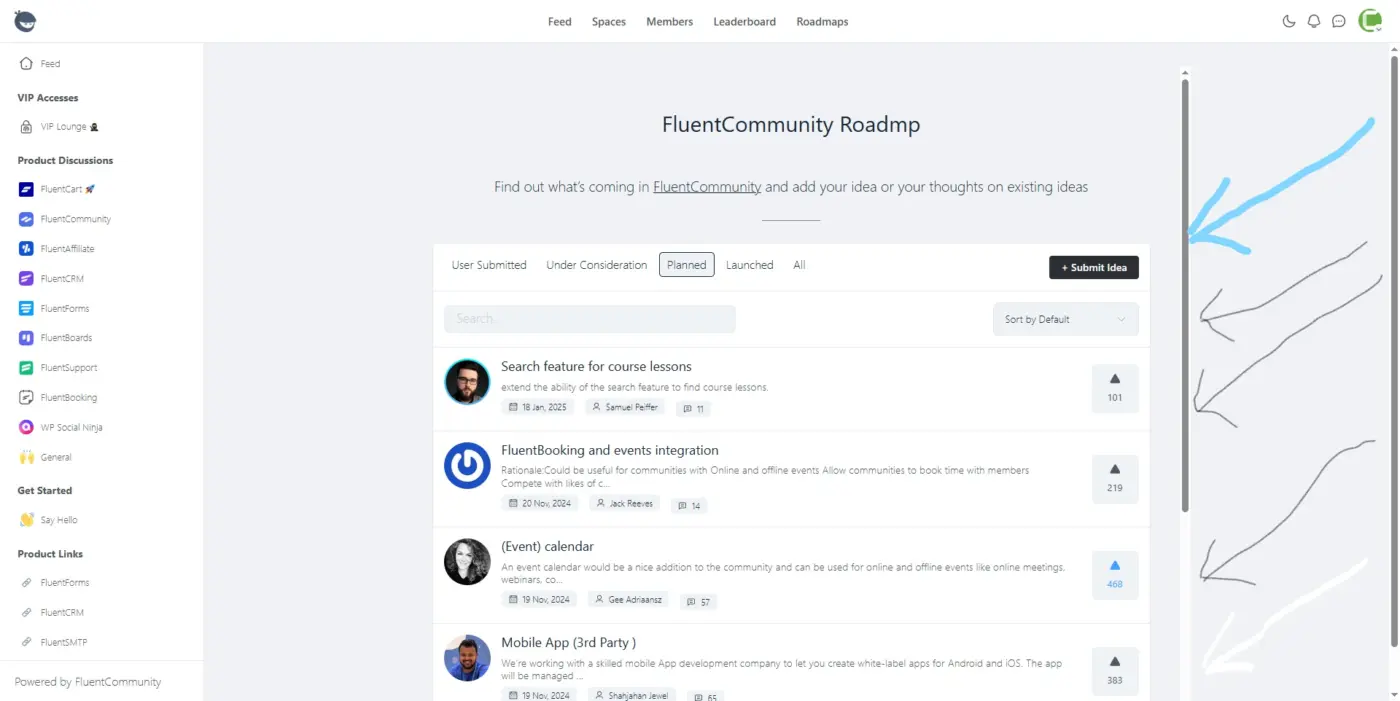
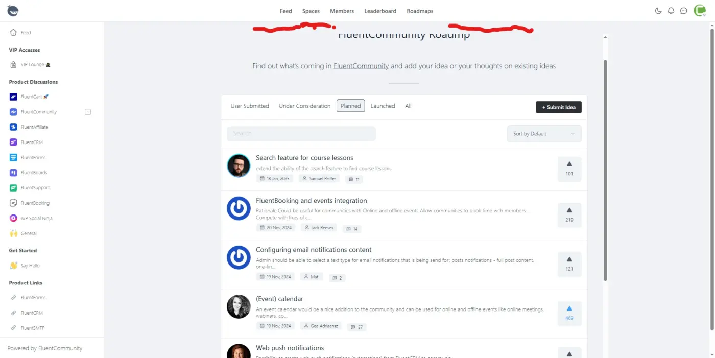
There are so many scroll lines on the desktop view, as you can see in the image with the blue sign.
Also, there's a blank space at the top, which I painted with red ink in the attached image.
I'm using the WP 2025 theme, with Fluent Community Frame. Those lines appear on pages with longer content
Could you please get rid of it?

Although I noticed a shift in social media a couple of years back already; these last months have clearly been an eye-opener for me.
But clearly, social media is slowly shifting into a wall of ads, and groups on social media are losing their identity by being too picky on what and where people can post something.
Smaller communities are the future to my opinion and if you ever considered having a community, Fluent Community is one of the way to go!