


Is the entire post shown in an email notification or just up to a certain character count?

I though before. When you reapply space access tags in Fluent CRM it gave access to the space in FluentCommunity but this does not seem to work anymore. Or do I need to remove the tags first and then add them again to the users in Fluent CRM. This is not the best scenario. Because sometimes you for get which people got this tag. If you have a lot of people and different tags. In FluentCommunity I have the option enabled sync space access with this tag.

I found this bug, on my site, there it is same. When you edit post, on the bottom is some content out of screen. Same goes to when you want move post to another space. It must came with some latest update.

Having an MCP integration is expected, especially today with AI and agents. Is there any timeline for this? Has it been considered?
Hello,
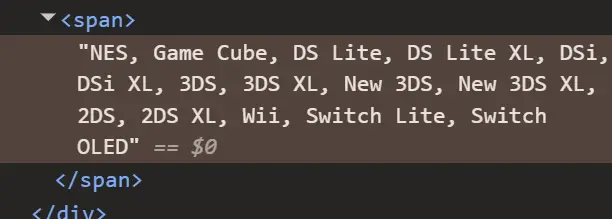
The current custom profile field output for multi-select fields looks very plain and difficult to customize properly with CSS because all values are rendered as a single line/string.
At the moment, I would need to rely on JavaScript just to separate and structure the items visually.
I would like to request a feature that allows multi-select profile fields to be rendered as structured list items or grouped elements instead of a flat text line.
For example, instead of:
SONY: PS1, PS2, PS3, PSP, PSVITA
NINTENDO: DS, 3DS, GameCube
I would like the ability to structure/style them like this using CSS alone:
Devices Owned
SONY:
[PS1] [PS2] [PS3] [PSP]
NINTENDO:
[DS] [N64] [GameCube]
The important part is that category labels such as "SONY" and "NINTENDO" can exist on their own line with a proper line break, allowing the items underneath to be individually styled, boxed, wrapped, or displayed in a grid/flex layout.
Having the values rendered as separate elements/items instead of a single text string would make customization much easier and remove the need for JavaScript workarounds.
Thank you.


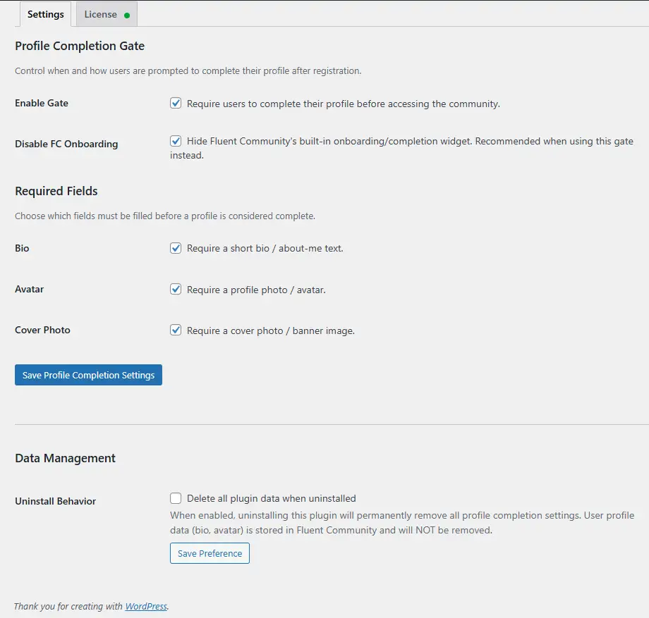
Built a plugin that blocks Fluent Community access until members fill in the profile fields you require. Bio, avatar, cover photo — independent toggles, mix and match. Gates new signups on registration and gates returning users with incomplete profiles on next login. Non-dismissable.
On the web it's a full-page overlay injected straight onto the FC portal pages, no separate page or redirect loop. Cover + avatar overlap layout matches FC's profile page on purpose. Bio textarea with a live character counter, social links section that auto-reads whichever providers you have enabled in FC, semi-transparent blurred backdrop so the site's still visible behind it.
Few specifics on how it sits on FC:
- Avatar check calls
XProfile::hasCustomAvatar()directly — same column FC reads for its compilation score, no Gravatar URL pattern matching - Saves go through FC's native media-upload + profile endpoints, so anything filled in via the overlay lands in the same place as if the user used FC's profile page directly
- Re-evaluates on
fluent_community/update_profile_data+ theXProfilemodel save event — gate lifts the moment requirements are met, no refresh prompt - Optional toggle to suppress FC's native "Complete your profile (X%)" widget so users aren't prompted twice
- Inherits FC's CSS variables for theming, light/dark is automatic
Standalone with FC, that's the main use. We also ship a native iOS/Android client (TBC Community App) — the plugin exposes /wp-json/tbc-pcom/v1/status and sets an X-TBC-Profile-Incomplete header on authenticated requests so the app can render a native gate screen instead of webviewing the overlay. Ignore that if you're web only.
$29 one-time, lifetime, one site per license.
Write-up + screens: https://www.twobirdscode.com/blog/item/tbc-app-web-profile-completion/

Currently, we already have thumbnail & featured image for Space.
But for course, we only have thumbnail option, no featured image option here.
I think we can also have Featured Image option also for Course, that will be displayed at the top of single course page, just like the space banner displayed at the top.
That will make the single course page better.
Thankyou!

Hi,
Right now, long comments in the feed take up a lot of vertical space and make the feed harder to browse.
It would be great to have an option similar to posts:
- show only the first 2–3 lines of a comment,
- then display a “Show more” button to expand it.
Ideally this could be:
- a global setting,
- or a configurable line/character limit for comments.
This would greatly improve feed readability, especially for communities with long educational discussions and detailed replies.
Thank you!



Is there a way to publically display a username instead of name? But also keep a record of first name and last name.
I was considering only using first name as a required field like on this website but would still want to capture full name in the profile