

⚠️ Please !
Ladies and Gentlemen,
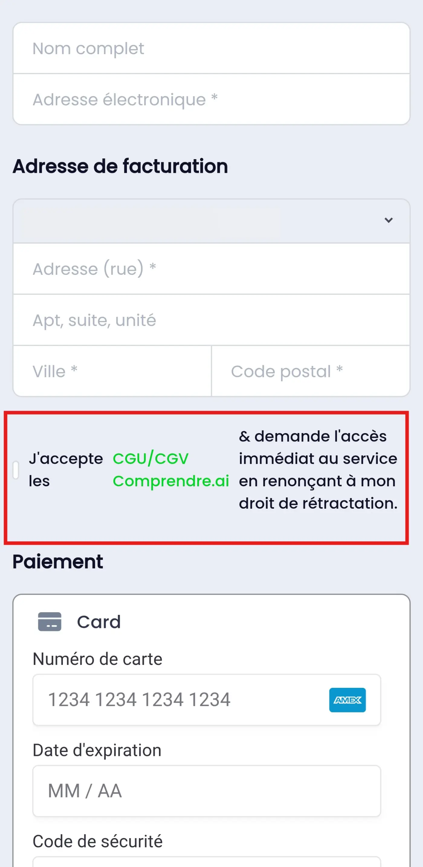
Please, this issue with the text formatting for the acceptance of the terms of use and terms of sale really needs to be fixed, especially since the checkbox disappears depending on the length of the text. It is both urgent and essential for European users. 👇
Thx
David

As I suggested in a previous post, you need to wrap the text in <p> tag, and use the CSS code I provided to fix the checkbox styling. Please see my screenshots.
However, I do agree that this is a bug and the ninja team should fix it.

Aaron Liang
Thank you, but this does not solve the issue. The checkbox is invisible. The text you are using is shorter than the French text. I have already shortened it as much as possible, and it’s impossible to reduce it further while still complying with the legal requirement.
D@vid just to make sure you are using the right code. I'm pasting it here again:
.fct_checkout input[type=checkbox] {
    min-width: 16px;
}

.fct_checkout_agree_terms label {
    align-items: start;
}

.fct_checkout_agree_terms p {
    margin-block-start: -6px;
    margin-block-end: 0;
}
It should work (checkbox visibility) regardless how long the paragraph is. If you are still having issues. Please share a link and I would be happy to inspect it for you, as each website is different.
Aaron Liang Thx
The checkbox is visible, but the text is broken. I’m fed up with constantly hacking things together with Ninja products. Why do we always have to wait weeks or even months to get fixes? I seriously wonder how products are tested before being released, including for something as obvious as translated text.
D@vid yes I understand your frustration. Obviously they didn’t test this thoroughly.
Again, I’m willing to help if you can share a link.