


Fluent Cart Customer Dashboard - UX styling issues
There's a issue with new fluent cart customer dashboard icons. Would be better to remove those active customer nav bars on the left so the icons be center aligned like the logout buttons. Also would love the ability to customize this thing a bit more without CSS, and or make it more dark mode friendly.
Also I wish the dashboard tab worked like a subscription vs recent purchases, which is redundant since we have purchase history in the tab below it.
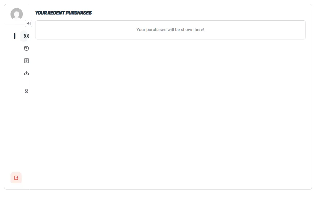

I added this css code to resolve this issue : .fct-customer-navs {
padding: 0 !important;
}
It's not ideal but always better than nothing

Looks like your themes styling is getting the priority. It requires css adjustment. Contact support if need assistance. Thanks