


Currently the 'Continue Shopping' link directs you to the page set as the Shop page in FluentCart's settings. I'm building a custom store setup where I'm not using a regular page as the main Store page. Your page selector currently only allows you to pick regular pages.
Please expand the available options to include archive pages and/or allow custom URL input.
When the cart is empty there's a default message with a "Continue Shopping" link. I think it would be nicer to have that be a button placed beneath the "Your cart is empty." text.
A dedicated page or section in the store's back-end to change certain e-commerce related terms, such as "Cart" for example, would be nice. Some stores prefer to use different terms. To stay with the cart example, you may find stores prefer "Basket". In my own language "Winkelwagen", "Winkelwagentje", "Mand", "Winkelmandje" are used.
There's probably more terms like that which could be globally managed.
We currently have the option to limit the product quantity to 1 per order. It would be very nice to have that be a customizable number. It's a feature I could really use for a project.

I wonder if there is an option (I might have missed) to mark a product “on Sale” to feature it in the shop? I know that we can use a compare price but that is not a clear red banner that sits on the featured image.

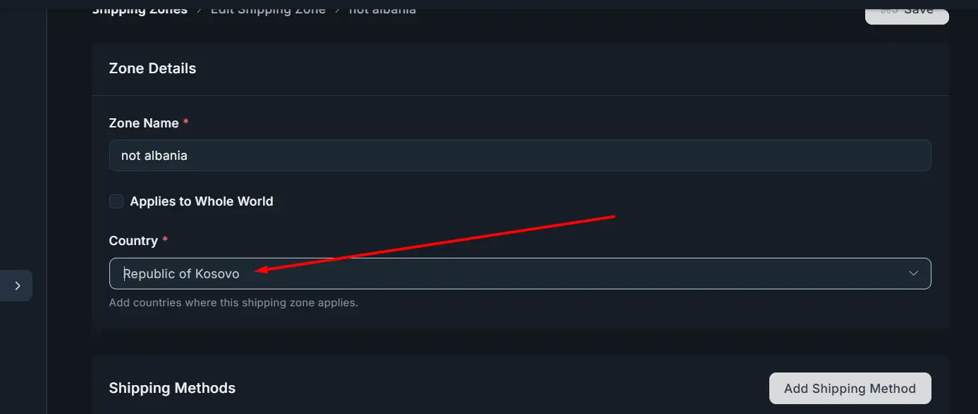
it would be awesome if we could select multiple countries here

Shahjahan Jewel / Ripon Sarkar
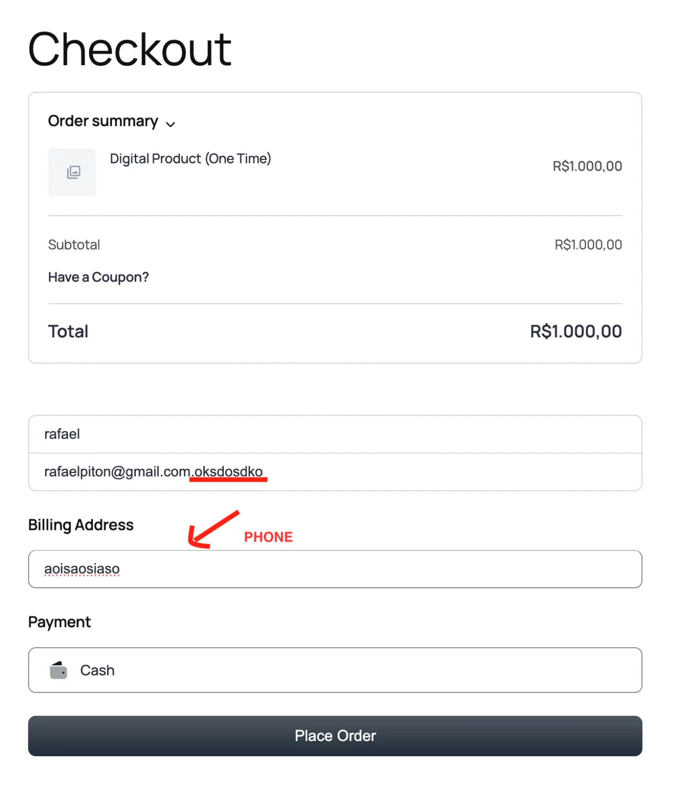
I am reporting several critical bugs and usability issues observed on the standard Checkout Page. These issues impact data integrity and user experience and should be prioritized.
1. Input Validation and Missing Indicators
A. Full Name Field
- Problem A (Missing Indicator): The placeholder is missing the required asterisk (*) indicating it is a mandatory field.
- Problem B (Validation): The system allows me to enter only a single name (e.g., rafael), not enforcing a full first/last name.
- Expected Behavior: The field must show the required asterisk (*) and validate for at least a first and last name.
B. Email Address Field
- Problem: The system accepts invalid email formats (e.g., missing a proper TLD extension like .com or .net).
- Expected Behavior: Must enforce strict validation for standard email format (user@domain.tld).
C. Phone Number Field
- Problem A (Invalid Characters): It accepts letters and random text (e.g., dksodksodsdkdskdoskdo).
- Problem B (Country Code): It lacks a mechanism for inputting or selecting the country code, which is essential for international orders.
- Expected Behavior: Accept only valid phone characters, and include a Country/Region selector.
2. User Experience (UX) Issues
The current error display method is hurting the user experience:
- Notification Duration: The time a notification stays on the screen is too short. Users cannot reliably read or process the information before it disappears.
- Error Message Location: The pop-up in the top right is not the best UX. Inline error messages (displayed directly below the field that failed validation) would provide much better clarity and feedback.
Steps to Reproduce
These issues can be verified by navigating to the checkout page and attempting to place an order after entering the incomplete or invalid data described above.
Thanks for your prompt attention to these issues!

Hi pls add support for stripe connect for situation like multi vendor or SaaS systems
And obvously add multivendor and saas system :D
I see that each customer putting something into the cart creates a cart hash (fct_cart_hash). Is there any option to see those carts in the backend? It would help to identify bottlenecks that prevented users from actually buying.
The time a notification stays on the screen is very short. This is terrible for the user experience.
https://docs.google.com/videos/d/1gbqHcS48OSbADngDdh7vketY-OrnYe2OaqipssD5u4U/edit?usp=sharing