UX Improvement Suggestions – Sidebar Groups Menu (Spaces / Courses)
Hello,
I would like to suggest a few improvements regarding the sidebar menu that displays Groups, which contain Spaces and optionally Courses.
These suggestions aim to improve readability and navigation, especially in communities with many spaces.
1. Tooltip on hover for Spaces and Courses
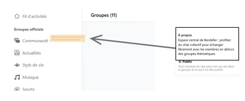
Would it be possible to display a tooltip when hovering over the name of a Space or Course in the sidebar menu?
This tooltip could show a short excerpt from the “About” field (description). This would allow members to quickly understand the purpose or topic of a Space without having to click and open its page.
There is already a page that lists all Spaces with a short excerpt of their description. The idea would be to reuse this existing information in a navigation context, directly inside the sidebar.
2. Limit the number of visible items per Group
In communities with many Spaces or Courses inside the same Group (collapsible section in the sidebar), the menu can become very long and require a lot of scrolling.
A useful option would be to:
- limit the display to 3 or 5 Spaces or Courses per Group
- add a “View more” button to reveal the remaining items on demand
This would make the menu more compact and easier to scan, especially when many Groups are listed one below another.
These improvements focus only on the interface, but they could significantly enhance navigation comfort and content discovery.
Thank you for your work on FluentCommunity.