

Request: a compact view of spaces
I think that Spaces take so much room on screen. Why not give them a compact look like in the prototype below? (Second screenshot is Spaces as they look now).
That would concern Spaces in the portal but also in one’s profile.
Thank you!



Thanks for the suggestion, we will review this request and provide update later on.
thank you dear Tawsif Ahmed Riyad

Tawsif Ahmed Riyad Please ooo... I like the current view; you can add this view as an option

Ohh...it's a nice proposal I think, just the banners should be design to be looked good also in square proportions no? so the info is at the center for example...maybe adding a note when adding them if this compact view is implemented :)
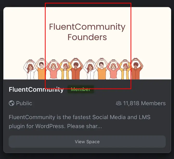
Jorge Nava (SolidCapo) photos across FC have the flaw that they can’t be resized proportionally to the size of the banners, avatars etc. I’ve addressed this issue but nobody answered me. In your example, I don’t imagine a square taken out of the banner, but a banner that becomes square shaped proportionally to the whole image. I don’t know how to explain it but maybe you understood me?
AS W No, didn't mean rezise or stretch it, just to be able to see what part of the image can and will be seen in the square format...like when you upload a profile pic that has to fit in a circle, that you can even zoom in or out accordingly to fit it as you want, something like that, not sure if I explained myself :P
Jorge Nava (SolidCapo) oh, go it !!!