

Move Links to Documents (Improved Mobile Experience)
The links bar currently displayed on mobile consumes valuable screen space while providing limited utility. To improve usability and streamline navigation, I propose removing the links bar and integrating its functionality into the Documents tab.
Proposed Changes:
-
Remove the Links Bar on Mobile: Free up vertical space and reduce visual clutter.
-
Move Links to the Documents Tab: Consolidate related resources under a single, intuitive location.
-
Add Quick Access to Documents:
- Place a button linking to the Documents tab either next to the space name (in the header) or
- Add a shortcut in the footer controls for quick reach on mobile.
Rationale:
- Improved Mobile Experience: Reduces wasted space on smaller screens.
- Simplified Navigation: Consolidates content into fewer, clearer places instead of spreading it across multiple bars/tabs.
- Consistency: Keeps the focus on primary navigation elements while still making documents quickly accessible.
- Efficiency: Places high-value resources (Documents) in more convenient locations where users naturally look first (header or footer).
Impact:
This change streamlines the mobile experience, reduces clutter, and ensures users can reach documents quickly without sacrificing screen space.
VOTE HERE: https://community.wpmanageninja.com/fluentcommunity-roadmp/#/idea/1043/
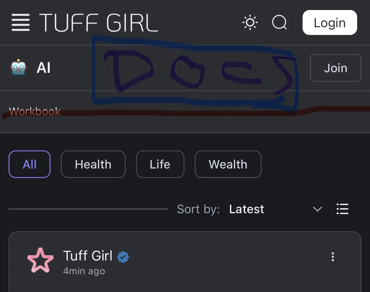


Not sure I like this idea. The links bar is optional so you could not use it if necessary. Also, not all spaces will have documents enabled (most of mine don't). Maybe have the links (like Wordbook in your example) show under the 3 dots menu but that wouldn't work if the user hasn't joined the space.

Thomas Oates The only way to post a link is in the links section. I'm not proposing to get rid of links, just add the option to add them to the document section for those of us who want to improve the user exsperence.
The document section is also hidden, so it would be nice to make it a button or add it to the footer as a button, so the user can navigate to all the assets in the group quickly in one place.
Sean I would agree that adding another button or two to the footer makes sense since there is room.
Thomas Oates You want to keep it simple for users. I think having one section that holds everything, that is a quick click at the bottom of the page would improve the user experience.
Once we have a dynamic sidebar, you will have a better UI option for users.
Dynamic Sidebar - VOTE HERE:
https://community.wpmanageninja.com/fluentcommunity-roadmp/#/idea/983/