

Lots of empty space on ultrawide screens
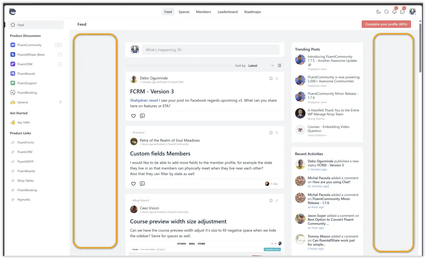
When I look at any community, including our own (still in testing) there's a lot of empty space on the sides of the feed like in the first screenshot below.
Is there a way to make everything zoomed in or compacted so that it looks like the second screenshot below?
Thanks.


.feed_layout .feeds.fcom_single_layout .fhr_content_layout .fhr_content_layout_body {
    max-width: 2680px !important;
}
Edit value as needed. This will make the content section use all the available space up to the value used.
Is this what you meant?

Thomas Oates yes! Thank you. Now where would I add that code? Not great with CSS here. I see a section for custom CSS, but it looks like it is only for the Pro version.
I went to WordPress Dashboard >> Appearance >> Customize >> Additional CSS and added the code, but it made no difference. Perhaps the code needs to specify the area where it needs to run?
Thanks.
Eli Linares Yep, the easiest place to add it is in the FluentCommunity custom CSS section. I have the Pro version so I wasn't aware that isn't available in the free version. Using the code here (https://github.com/WPManageNinja/fluent-community-docs/blob/master/code-snippets.md#add-custom-css-to-portal) may work. You could use FluentSnippets to house that code instead of having to add it to your theme's functions.php file.
Thomas Oates I wasn't ready to get the Pro yet, since we are still in the testing phase and wanted to extend the time without paying for a little more, but I just hit the bullet and purchased the Pro.
I was able to insert the code now, and it worked and looks better. However, there's still space on both sides, and if I increase the number too much, then everything is centered to the right. I wish I could make it look like in this promotional screenshot from the Fluent Community website. Everything fills the entire screen, and there are no gaps.
Try this:
.feed_layout .feeds.fcom_single_layout .fhr_content_layout .fhr_content_layout_body {
    max-width: 2680px !important;
}
.fcom_feed_box {
    max-width: 2680px !important;
}Thomas Oates thank you so much! Now that did the trick. Looks great now.

Thomas Oates I added Thomas' code directly to the CSS field (in FluentCommunity > Customizations), and it worked perfectly — without FluentSnippets installed.

The reason, we set the max width for the feed is, this is the ideal width for social media feeds and this width is followed by all the big techs like insta, FB, twitter etc.
Shahjahan Jewel I've been wondering why it was set like that. I'm guessing all the big techs did studies but it just seems like a waste of space especially given how cheap large monitors are these days.