

Improving Placeholder Behavior in Card View
I suggested an improvement regarding the card layout when a post does not contain an image.
The idea would be to automatically use the space cover image instead of the default placeholder, in order to improve visual consistency and make spaces easier to identify.
You can find the detailed comment here : https://community.wpmanageninja.com/portal/post/introducing-fluentcommunity-2-2-our-bi?comment_id=48101
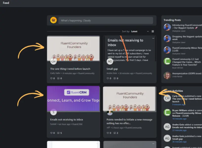

I have a Lot of Video Posts where i‘d like to be able to set a title Image for Card View (e.g. Office Hours image in card view, while all the Posts contain Videos)

Thank you for the suggestion, will review it.

The idea is to replicate what is done on the "Spaces" page, which does a good job of showing the "covers" of the spaces and they are also "cropped," this would be nicer than a single image.

I came here to say the same :) It at least would be nice to have flexibility to choose what we want when the post has no image or video.
Gee Adriaansz It's possible with a CSS manipulation as advised here https://community.wpmanageninja.com/portal/post/introducing-fluentcommunity-2-2-our-bi?comment_id=47935 this can help, but for me it's not an ideal solution.
Claudy Scoufy, this is given just for the time being. We will review it for more accessibility regarding default card placeholder, thank you.
Claudy Scoufy thank you! Me for its also not an ideal solution so I will wait :)