

Fluent Messaging (Fluent Community Chat) > Enhancement sugestion
On mobile, it’s not always easy to distinguish between sent and received messages at a glance.
Using different colors for each (similar to WhatsApp) could help a lot. In any case, making the distinction crystal clear would significantly improve the mobile UX.

Also next to your own message can be also shown your avatar.

Drive Zone Yeah. I was thinking of that too. Thank you for bringing it up!
btw, for color styling you can use selector "div.message.message--own"
Drive Zone Cool!
Feel free to use my code if you want:
.fluent-messaging .message--own .messagereply,
.chat-widget-wrapper .message--own .messagereply {
color: #dadde1;
}
.fluent-messaging .message--own .messagereaction-count,
.chat-widget-wrapper .message--own .messagereaction-count {
color: #ffffff;
}
.fluent-messaging .message--own .messagereaction,
.chat-widget-wrapper .message--own .messagereaction {
background-color: #ffffff3b;
border: 1px solid rgb(255 255 255 / 42%);
}
div.message.message--own:hover {
background-color: #1877f2;
}
div.message.message--own {
background-color: #0088ff;
}
.fluent-messaging .message--own .messagetext, .chat-widget-wrapper .message--own .messagetext, .fluent-messaging .message--own .messagetime, .chat-widget-wrapper .message--own .messagetime {
color: #ffffff;
}
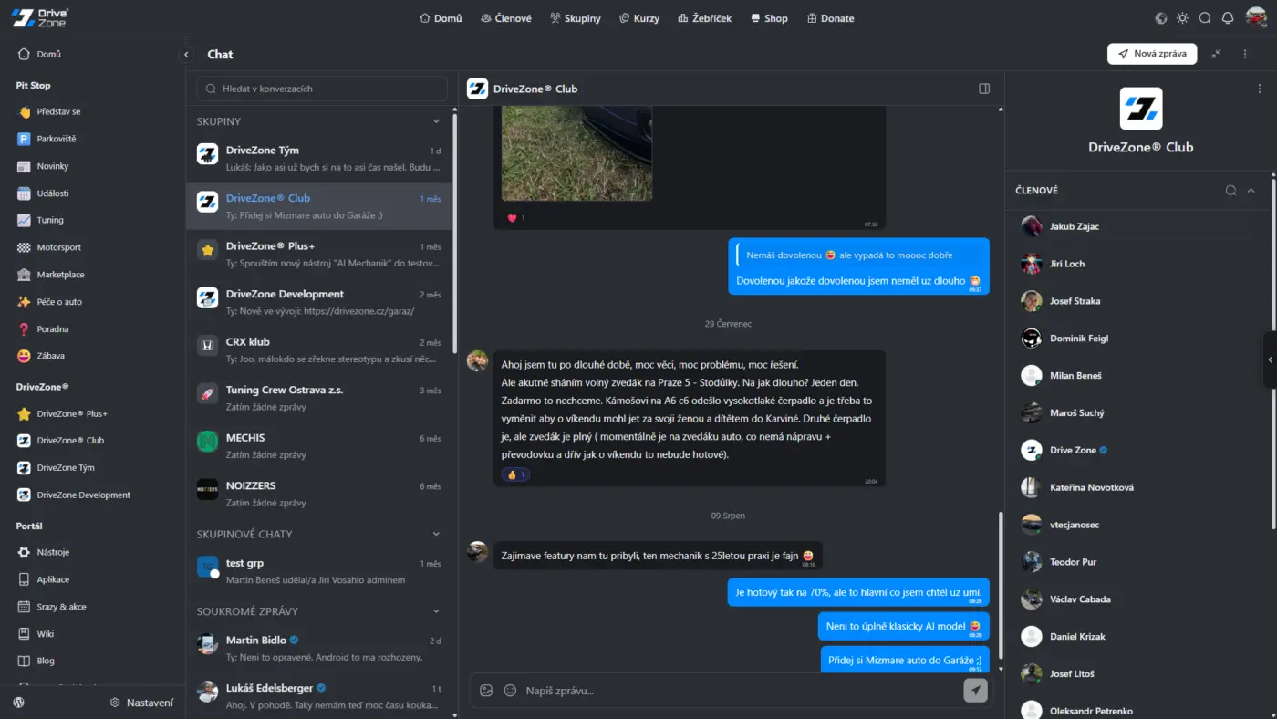
Drive Zone Looks perfect! I will give it a try. Thanks!
Jorge de los Reyes change colors in code as you want.