

Enhancing Design Consistency for a More Beautiful Interface
It would be better if the left menu had the same feel as the primary menu. This change would make the design more cohesive and aesthetically pleasing. What do you guys think?
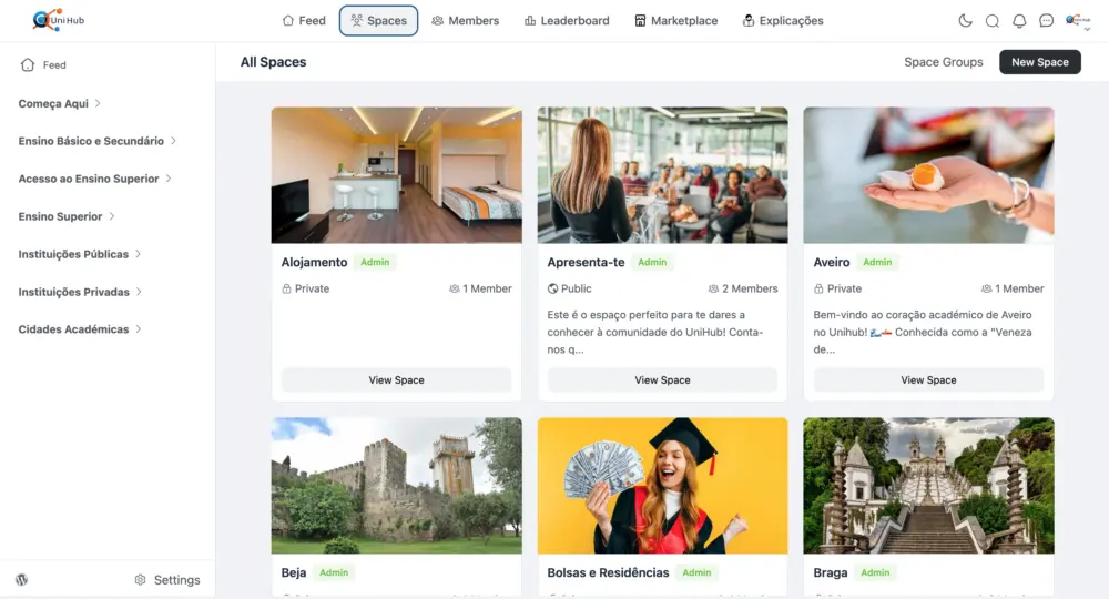

We can't use svg on group titles!