

Design adjustments
I wanted to share some feedback regarding the comment section layout. For a while, I’ve noticed that the “View more comments,” “Like,” and “Reply” buttons on each post feel quite small. I think it would be great if they were slightly bigger for better visibility and usability.
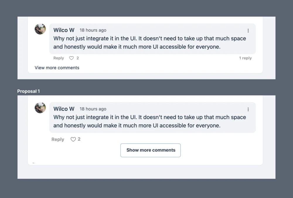
Additionally, I believe including a more prominent “View more comments” button—similar to what Circle does—would make the section look cleaner and more user-friendly. In the proposal attached, I’ve enlarged the “Reply,” the "heart icon", and the "number", and I’ve added a button for viewing more comments. Just a quick mock up.
What do you think of this idea?

I agree that they could be a bit bigger. But I'm really not fan of the show more comments, not here, not anywhere. Either go for pagination or use Discourse / NodeBB technology: https://community.wpmanageninja.com/portal/space/community-meta/post/ideas-on-topic-interface-featurerequest
Long topics are horrendous on both Fluentcommunity aswell on Circle. The trend to use not any kind of indicator is really bad for the user experience once you have 40+ comments. Add the threaded replies and it's even worse! I really hope Shahjahan Jewel and the team will take a look at discourse and nodebb topic navigation.
Example image added: If you ask me when your in a topic you shouldn't be bothered by al kind of other columns with data that has nothing to do with the current topic. You should just be able to manouvre quickly and nicely through the topic.

Wilco W, You can already isolate the topic from all the others by pressing on the date of the post. If you prefer to view it like that, although you will have the sidebars. I've seen that little toggle with dates on Discourse, it's useful but I personally don't find it essential, and only works on desktop. For mobile most softwares remove it. I do agree with a bit of organisation by date or most popular.
I guess as long as the current button of view more comments is bigger I'm happy, but we are all different! :)
Pat k I know that you can click it. Having to sidebars add nothing usefull to the topic. And it doesn't only work on desktop, it is available on mobile just as well and works great on both Discourse aswell as Nodebb. Then go back to Circle or fluentcommunity it does not work great in large topics.
Indeed everyone is different, but I notice some people never have experienced circle with 100+ comments. It just sucks in my opinion and I can't really see how you could enjoy that experience.
I think it should Atleast be an option. Let the people choose between some options: https://youtu.be/m4w3RkDvz_k?si=6imc3srxMrzh3AjI