


Course UI/UX
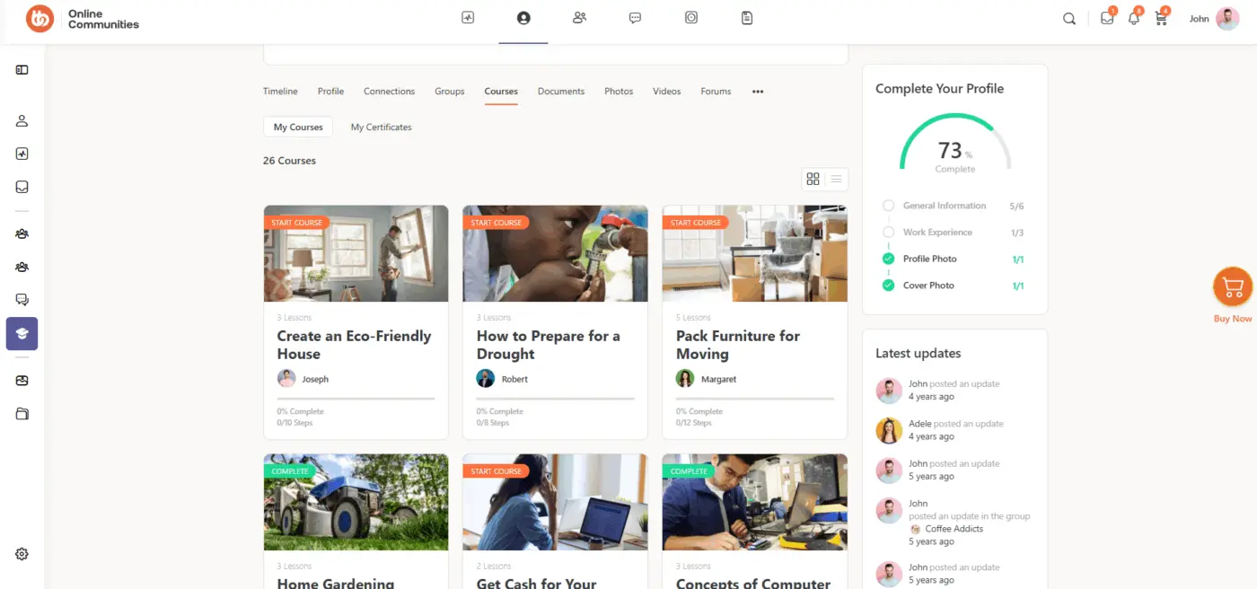
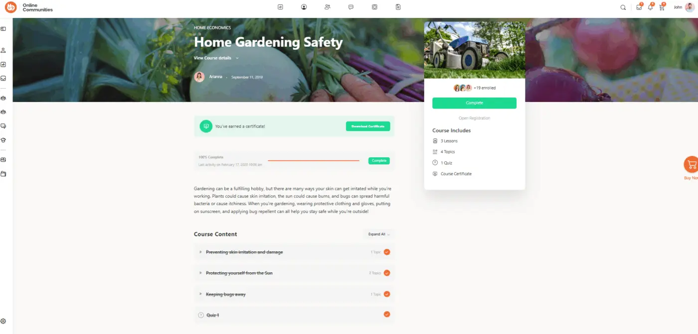
I hope the WPNinja team consider updating the course UI to provide better user experience for learners. Attached are screenshot from Buddyboss integrated with Learndash for inspiration. 😃

I support this :)

Me too. I also have a lifetime license for BuddyBoss and used LD for years. But I left because of numerous problems they couldn’t fix. I’m SO happy I discovered FluentCommunity after that, and I hope they’ll keep improving the course UI over time. Because yes, it really does look nice. :)
Same here!
I also remember how they used to push those LTDs…
Not exactly the nicest selling tactics, tbh 🙈
There’s an ocean of distance between both philosophies with the ninjas 🥷🌊
BB is so nice, but the performance: ouch!
Jorge de los Reyes I agree! I was one of the early customers and it looked very promising at first. But in the end, they really blew it.

Fluent Community's Course UI and UX is fine for now. But they should really work on their Lesson's UI and UX. To give an example, you could consider looking at "The Focus Mode" of the popular LMS plugin, which actually provides the feeling that you are indeed inside a focused learning space. Fluent Community's Lesson UI ,unfortunately, feels like you are not in a very focussed space and are just left learning in an open, random space.
arjun arjun True. Jean-Marc DEDEYAN also shared a post with great suggestions about the course UI. I’m sure the team has taken note of it as they always do, but of course these things take time.

What from these screenshots is missing in FC? They seem pretty similar to me? There's lots of visual changes that can be done with css. The top banner is definitely one that needs to be added for sure.

I fully agree that the Course experience needs an update, and I’ve shared several roadmap suggestions to help make courses more engaging, immersive, and valuable for both students and creators. Here’s a quick overview of what I proposed and why:
-
Dynamic Sidebar - https://community.wpmanageninja.com/fluentcommunity-roadmp/#/idea/983/
- Create more immersive navigation for each course by allowing a flexible sidebar layout. This helps students see where they are and easily jump between lessons or resources.
-
Links → Documents Tab - https://community.wpmanageninja.com/fluentcommunity-roadmp/#/idea/1043/
- Consolidate resources by moving links into the Documents tab so everything lives in one central, easy-to-find location.
-
Polls Inside Courses - https://community.wpmanageninja.com/fluentcommunity-roadmp/#/idea/1005/
- Add quick polls to capture student feedback on a section or gather top takeaways. This encourages reflection and lets students see what others are learning.
-
Calendar Tab - https://community.wpmanageninja.com/fluentcommunity-roadmp/#/idea/1044/
- Enable scheduling of webinars and live sessions directly inside the course, giving students structured opportunities to connect and learn in real-time.
-
Private Space Tab - https://community.wpmanageninja.com/fluentcommunity-roadmp/#/idea/1018/
- Provide students with an exclusive discussion area tied to the course. This creates a sense of community, allows peer-to-peer feedback, and makes students feel they have special access others don’t.
-
Level Unlocks - https://community.wpmanageninja.com/fluentcommunity-roadmp/#/idea/1040/
- Introduce progression mechanics where students unlock content as they advance. This keeps them engaged longer, gives them goals to work toward, and adds an element of fun to the learning process.
-
Preview Mode - https://community.wpmanageninja.com/fluentcommunity-roadmp/#/idea/989/
- Allow potential students to preview the course layout (lesson list, structure, flow) without requiring creators to manually build a landing page. This not only builds buyer confidence but also improves SEO visibility, helping more people discover and purchase the course.
👉 Each of these suggestions is designed to make courses more interactive, better organized, and community-driven, while encouraging students to stay engaged and complete their learning journey.

Sadly, the entire course module is half baked.
You could create a better "course" module using regular posts, a category, and a couple really simple functions. It's a real shame, had some potential... overall a waste of development in my opinion.
Tyler Gebhard I don't think its a waste, they just have a long way to go. If they support this as well as they have supoorted some of their other products, it can be a great way to build SEO for your website.

Definitely support it !!!