

Relocate Mobile Menu (Hamburger) to the Right Side
Summary:
Currently, the mobile menu (hamburger icon) is positioned on the left side of the header, while the login button sits on the right. This layout feels inconsistent with most modern websites and mobile applications, where the hamburger menu is placed on the right-hand side for easier and more intuitive access.
Proposed Change:
Move the mobile menu (hamburger icon) to the right side of the header, replacing the position of the login button. The login button can be shifted leftward or placed in a secondary position, as it is accessed less frequently compared to the main menu.
Rationale:
- User Experience Consistency: The majority of websites and apps place the hamburger menu on the right, setting user expectations.
- Ease of Access: On mobile, the right side is more convenient for right-handed users (the majority), allowing quicker access to the primary navigation.
- Prioritization: The menu is accessed more frequently than the login button, so it should be the most easily reachable element.
- Visual Balance: Moving the menu to the right creates a cleaner, more familiar visual hierarchy.
Impact:
This change improves usability and aligns Fluent’s mobile experience with common web/mobile standards, reducing friction for new and returning users.
VOTE: https://community.wpmanageninja.com/fluentcommunity-roadmp/#/idea/1041/
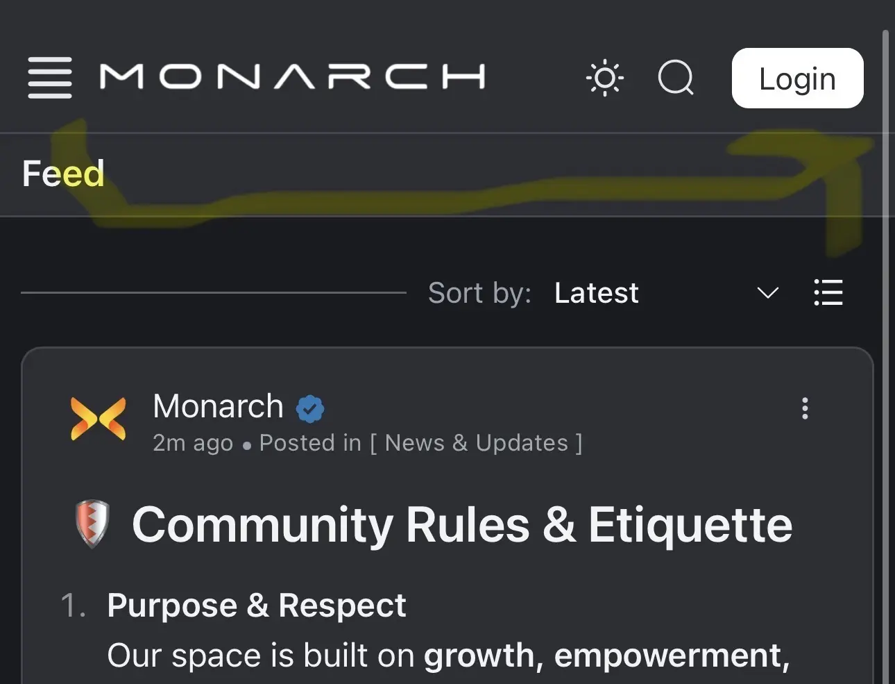

This css should do it I think - not fully tested it but seems to work.
@media (max-width: 1024px) {
.feed_layout.space_opened .spaces {
right: 0;
left: auto !important;
}
.fcom_top_menu {
position: relative;
}
.fcom_top_menu .top_menu_right {
padding-right: 60px;
}
.fcom_top_menu .space_opener {
position: absolute;
right: 10px;
top: 50%;
transform: translateY(-50%);
}
}

it works! thank you for sharing.