


In mobile view, users can scroll to the right outside the visible area

The register and login pages feel quite limited and could use more flexibility and polish.
- Allow full-page design customization instead of only adding an image to half the page.
- Add custom signup fields (e.g. onboarding checkboxes that automatically redirect users to relevant groups and subscribe them to relevant newsletters and suggest them courses)
- Add a waitlist option so users can join once enough people request access to the same space, creating more organic growth instead of letting people join empty spaces and not stay.
- Remove the need to enter passwords twice (that's always annoying to do...) and avoid requiring full names during registration.
- Fix the wp gateway so it looks more native to the community.
Thank you for your feedback on that (any other idea is more than welcome!)

Is there anyway to pin a comment to the top or is that something that may be considered?

I would like to have sitemap avaible also for locked community (only for members). Is there any way how to allow FC generate sitemap when community is locked?
Can also bots and crawlers get on site or not when community is locked / private?

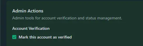
Recently, Anne-Sophie W asked about the use cases for the verified badge.
I’d like to take this opportunity to suggest an enhancement to the Members → Filter feature.
I’m sure it would be extremely helpful to allow filtering by verified profiles, making it easier to quickly find founders, team members, admins, moderators, experts, or other trusted accounts inside the community.
This could also open the door to improving the Leaderboards or discovery experience. Similar to what X (formerly Twitter) used to do, public communities could benefit from sections such as:
- Who to follow
- Popular profiles
- Verified members
- Recommended experts
- Top contributors
For private communities this may be less relevant, but for public-facing communities and forums, I think it could significantly improve onboarding, orientation, engagement, and overall social discovery.
It would also give more practical value to the verified badge beyond simple visual recognition.
Happy building 🚀
I mean, it's not as if we could manually verify users with an ID check or something like that, so what does that even mean and what is it for? Thank you

Hi FluentCommunity team,
I've found a rendering bug with the Notification Email feature for course lessons.
Summary
The {{section.url}} placeholder works correctly when inserted as plain text, but it fails to render as a clickable link when the same placeholder is attached to text as a hyperlink. Instead of producing an <a> tag with a working URL, the raw HTML is exposed in the email body.
Steps to reproduce
- Go to a Course → Lesson → Notification Email editor.
- In the email body, type some anchor text (e.g. Open the lesson).
- Select the text and add a hyperlink using {{section.url}} as the URL.
- Save and activate the notification email.
Expected behavior
The anchor text should render as a clickable link pointing to the lesson URL, e.g.:
<a href="https://…/lesson-url">Open the lesson</a>
Actual behavior
The email renders the raw markup as visible text, something like:
<a href="https://…/lesson-url">Open the lesson
The opening <a> tag is exposed as plain text, and the closing </a> tag is missing entirely. Because the anchor element is never properly formed (and never closed), the text is not rendered as a clickable link, and the {{section.url}} placeholder inside the href attribute is not replaced with the actual lesson URL.
Additional notes
- Placing {{section.url}} directly in the body as plain text works as expected — the URL is substituted correctly.
- The issue only occurs when the placeholder is used inside a hyperlink's URL field.
- This makes it impossible to create properly styled call-to-action links in lesson notification emails.
Could you confirm whether this is a known issue, and let me know if there's a recommended workaround in the meantime?
Thanks!

It can get annoying when you click save to preview the changes and have to click on the about tab to get back.
Having it close the edit section and return back to the profile page would be optimal.

https://academy.bricksbuilder.io/getting-started/
The ui for learning is awesome.