

FluentPlayer – Mobile Issues & Improvements
I’d like to report a few issues and potential improvements regarding the mobile experience with FluentPlayer.
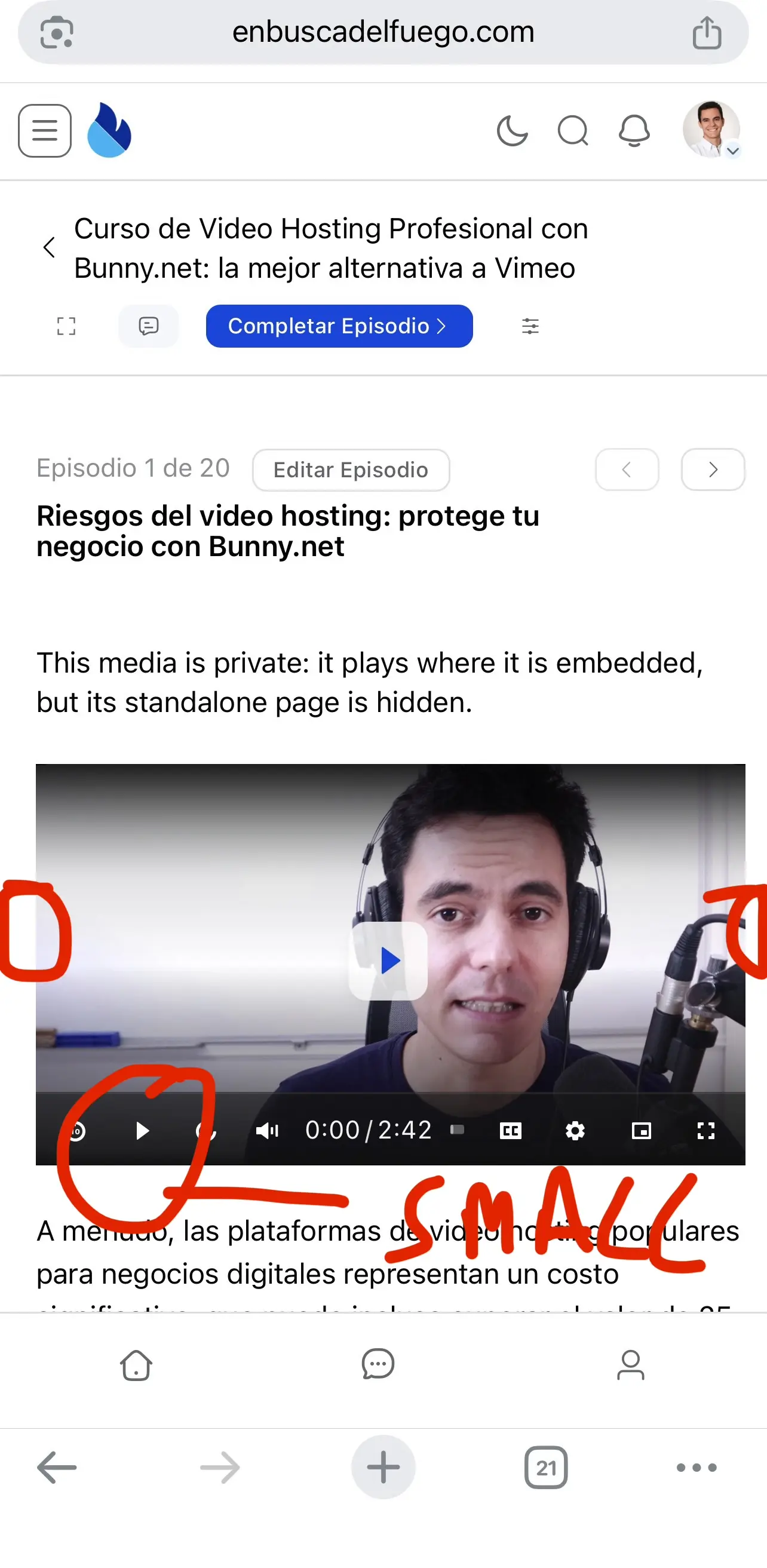
1.Player controls are too small on mobile
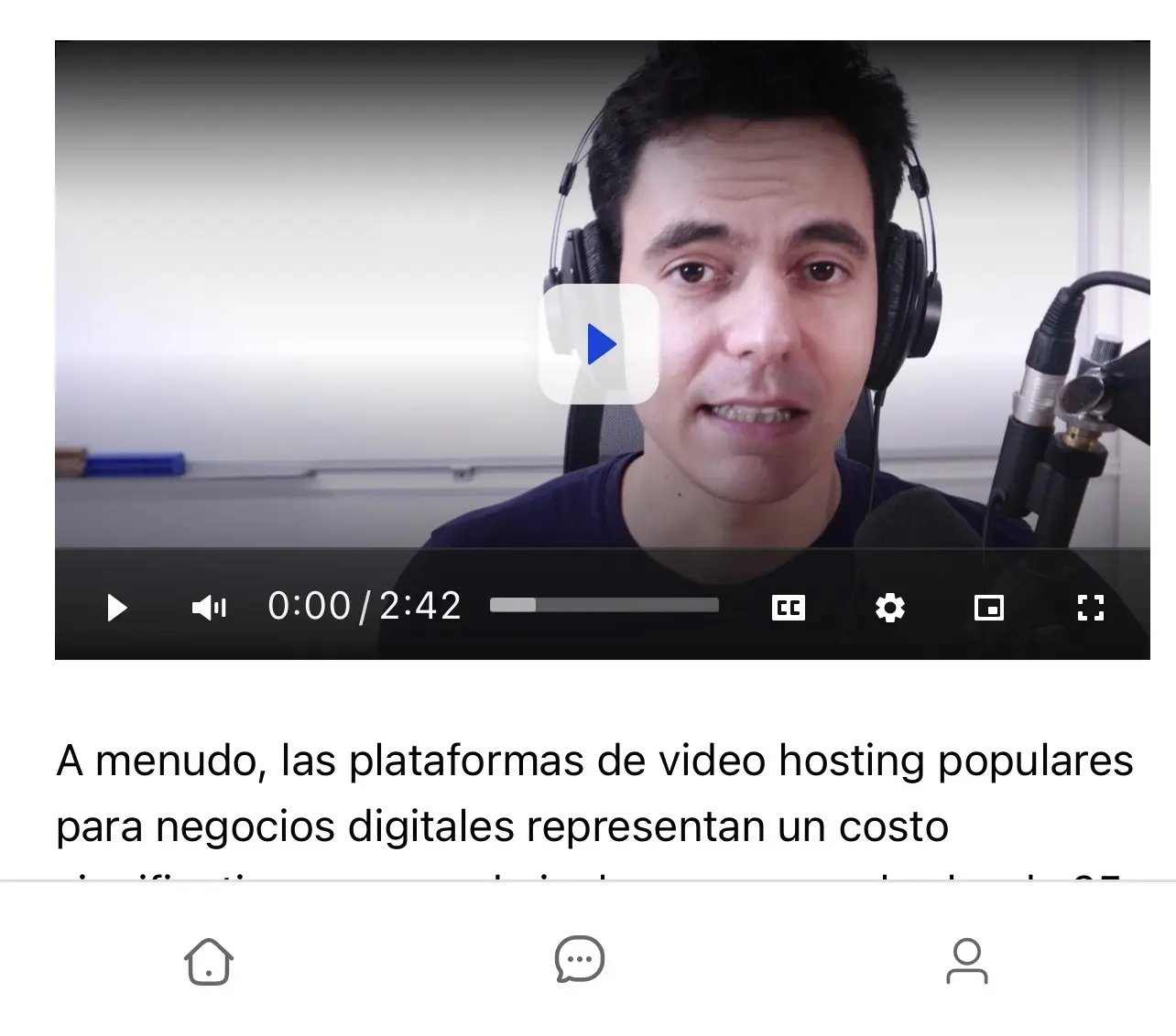
Currently, the play button and other player controls appear quite small on mobile devices, especially when compared to other players such as Bunny.net’s native player.
Making these elements larger and more touch-friendly would significantly improve usability on mobile.
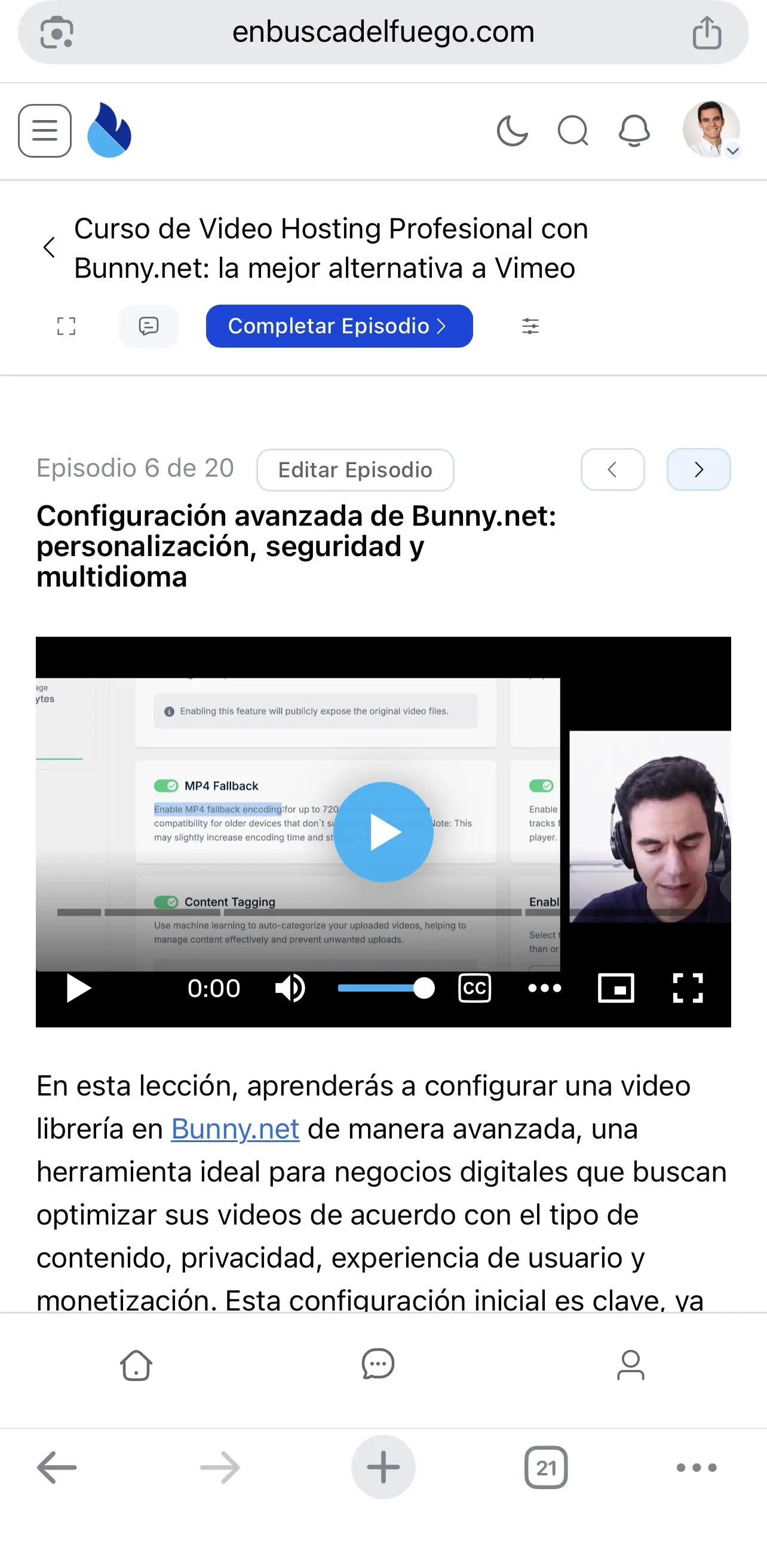
Screenshots for comparison:
🔵 Blue player = Bunny.net native player
⚪ White player = FluentPlayer
Removing the 10-second forward/backward controls doesn’t seem to increase the size of the remaining elements either, so it doesn’t really solve the issue.
2.Uneven lateral padding in FluentCommunity lessons
I’ve also noticed that, within FluentCommunity lessons, the lateral padding around the player seems uneven. There is noticeably more space on one side than on the other.
It would be great if the player could be properly centered and use the available mobile width consistently.
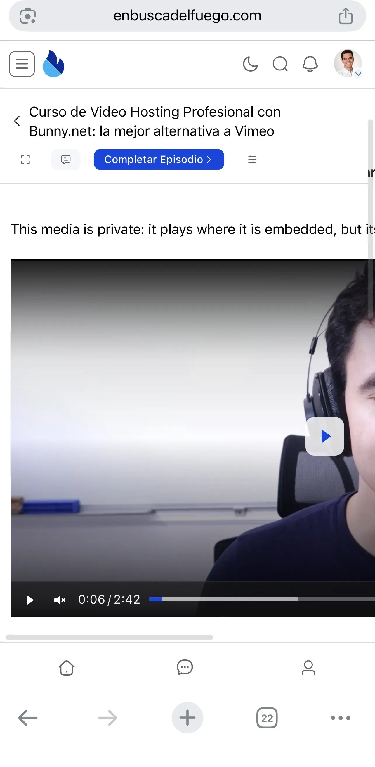
3.Fullscreen → portrait mode breaks the page
There also seems to be an issue when using fullscreen mode on mobile.
If you open a video in fullscreen, rotate the device to watch it in landscape mode, and then rotate it back to portrait / exit fullscreen, the FluentCommunity lesson page layout breaks.
This is probably the most important issue, as it directly affects the viewing experience and requires the user to recover from a broken page layout.
Overall, I think FluentPlayer could benefit from some additional mobile optimization. The player itself works great, but improving these details would make the experience feel much more polished and native on mobile devices. 😄