

Minor bug FluentCRM 3.0
I'm running several tests, but for now, I'd like to report a small issue that could be corrected.
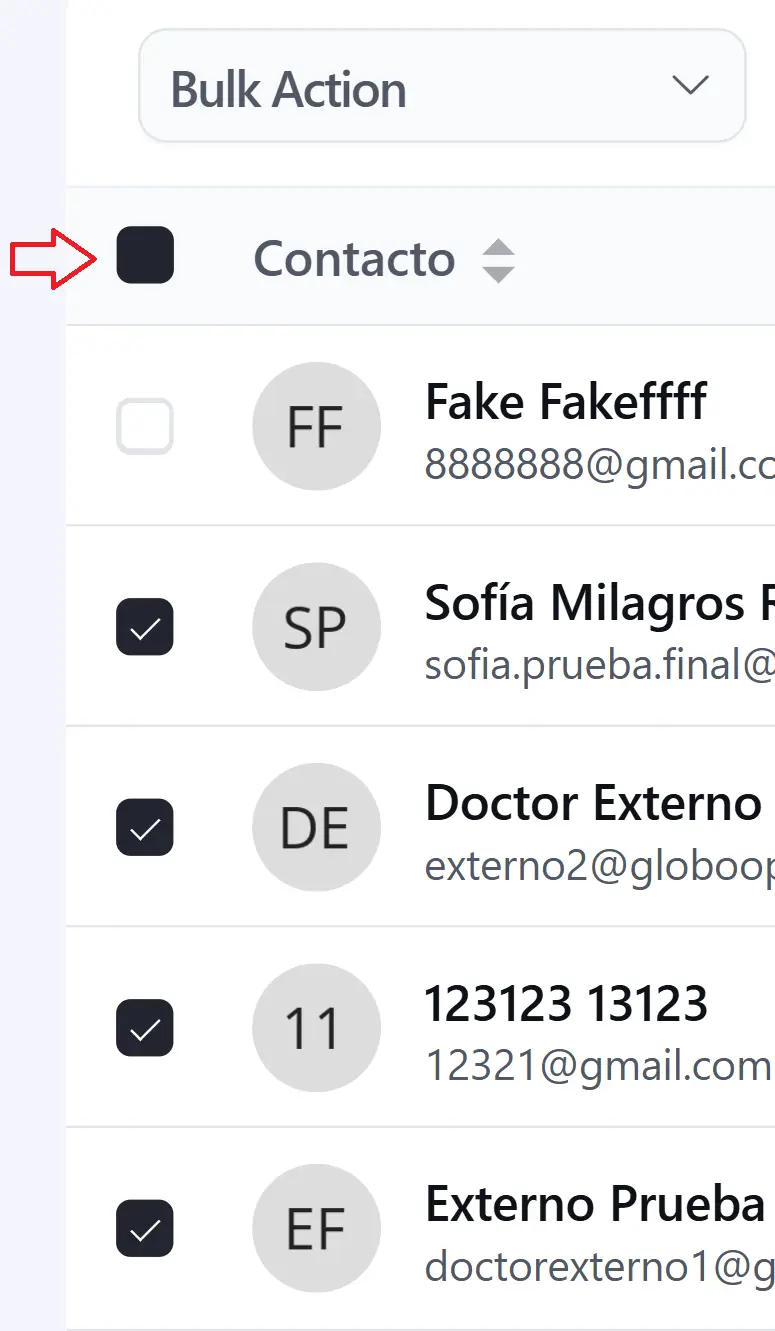
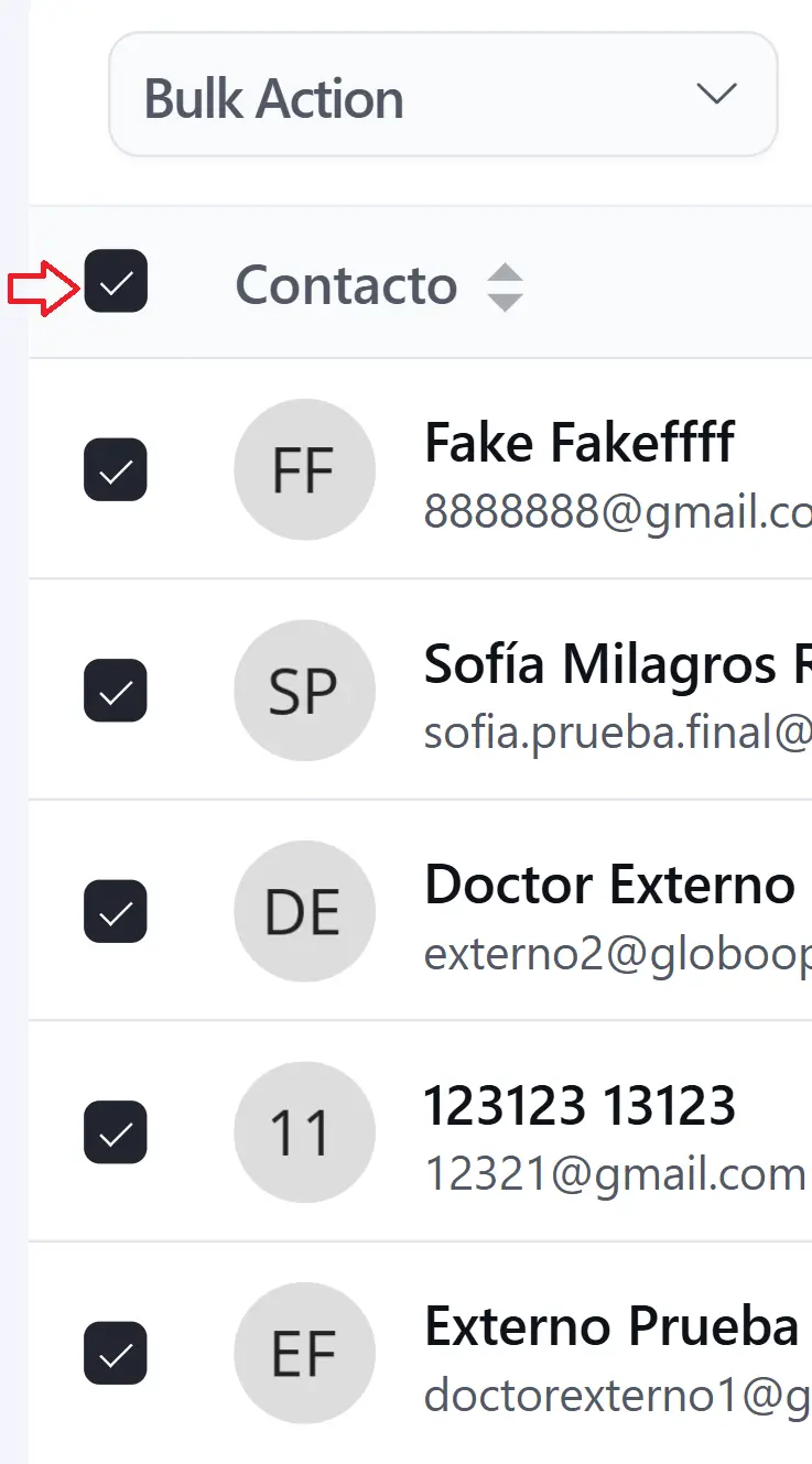
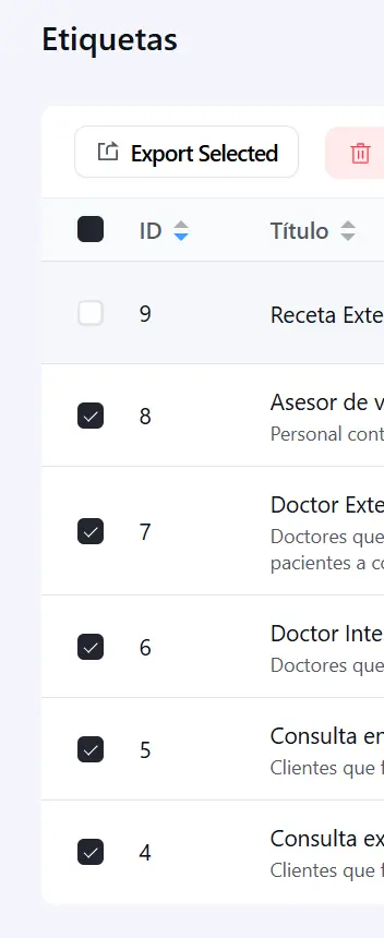
The "master checkbox" (responsible for selecting or deselecting all items) works correctly when the entire list is selected, but if one row is deselected, the checkbox turns completely black, even though the minus sign (-) should appear.
This happens in all lists: contacts, tags, companies, lists, automations, etc.
It only occurs in version 3.0; it worked correctly in previous versions.


Another one:
Clarity in hierarchy: Titles and descriptions should be more clearly differentiated in the "Automations" section. The title competes with its description, which could make it difficult for the user to read.
For example, it is displayed correctly in the "Tags" section.
Want to add, that It's difficult to visually differentiate the sections of the grouped fields.
As I wrote in this post about Custom Fields: https://community.wpmanageninja.com/portal/space/fluent-crm/post/dreaming-with-fluentcrm-3-0
... a good alternative would be to make the field groups expandable, with "Expand/Collapse" options. This way, you wouldn't have to scroll so much and could easily see only what you're interested in at the moment.
While it wasn't entirely appealing before (v2), at least the separation between field groups was clearer.
Conclusion about Grouped Fields:
- v2: Clearer differentiation, but outdated design.
- v3: Difficult differentiation, but really nice look & feel. Also, Expand/Collapse feature is needed. As well as Drag & Drop to organize them and the conditional display of fields based on the contact properties.