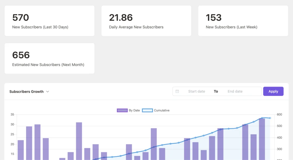
Feature Request - Growth Rate Reports
Is there a public roadmap like FluentBoards has yet?
I'd like to propose additions to existing reports and some new ones...
== Add Prediction of Subscriber Growth or Loss for the Coming Month
To further enhance reporting capabilities, I propose adding a subscriber growth prediction feature. This feature would analyze the average growth rate from the past few weeks and project potential subscriber growth or loss over the next month.
For example, based on recent rolling averages:
• If your list has been growing at an average of +3% per week over the last few weeks, you could expect roughly a 13-14% increase in your list size by the end of the next month, depending on fluctuations in the rolling average.
• Conversely, if there has been a trend of unsubscribes or churn, and the list has been shrinking at a rate of -1% per week, it would project a 3-4% loss by the end of the next month.
This predictive feature would adjust dynamically based on actual performance data and rolling averages, allowing users to monitor expected outcomes and better strategize their campaigns.
== Add Percentage Change Plot to Existing New Subscribers Chart
I propose enhancing the existing chart for new subscribers by adding a percentage change plot that tracks the relative growth or shrinkage of the list. This would allow users to see, alongside the absolute number of new subscribers, how much the list has changed as a percentage of the total list size during each period.
For example:
• If your list has 100 subscribers, and you gain 10 new subscribers today, the chart would display a 10% increase for that day.
== Net Subscriber Change (Daily, Weekly, Monthly)
This chart would present a combined bar and line graph:
• Bars: Represent daily (or weekly/monthly) net subscriber change, with green for positive (new signups > unsubscribes) and red for negative (unsubscribes > signups).
• Line: Overlay a cumulative net change over time (similar to stock price trends). This visual combination would allow users to see both granular daily/weekly changes and overall list growth in one glance.
== Growth vs. Unsubscribe Breakdown (Stacked Area Chart)
• This stacked area chart would have two key areas: New Subscribers and Unsubscribes, showing how these two categories contribute to the net change each day (or week/month).
• It could include trendlines for cumulative subscribers and cumulative unsubscribes, allowing users to instantly understand the balance between growth and attrition.
== Growth Rate Velocity Chart (Rate of Change)
• This chart would specifically focus on the rate of change (growth velocity) over time, represented as a line graph. You could plot:
• Signups Growth Rate: The percentage increase in new subscribers over the last period (day, week, month).
• Churn Rate: Percentage increase in unsubscribes.
• Net Growth Rate: The difference between the two, showing the overall list velocity (whether it’s growing faster or declining).