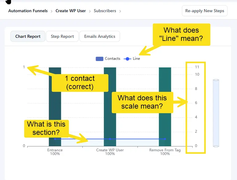
FCRM 3.0: Automation Chart Report Improvement
The chart displayed for an automation has an ambiguous stat "Line". It's not clear what that is representing. Also, there is a scale on the right which I'm assuming is supposed to represent "Line", but the scale seems to be off.