


Difficulty reading in dark mode in Docs.
I was reviewing the new documentation page. I only have one minor observation, and it's about aesthetics.
I see that the logo used is the old version; they're not using the new one. I'm just worried they might not have noticed 😅
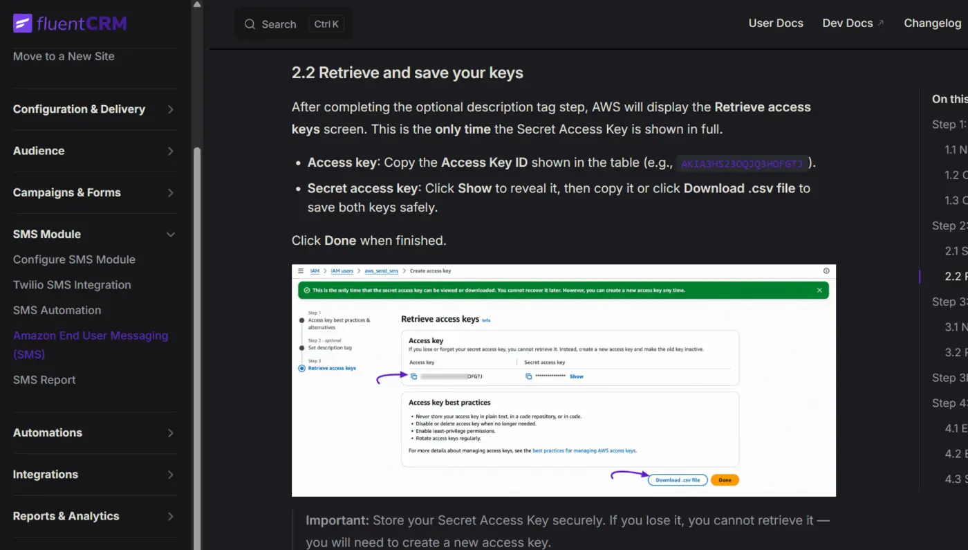
In dark mode, the purple color used for all the links and highlights makes it very difficult to read. Perhaps you could make it more legible.
Cheers!

I've passed this onto the team