

Yanking on scrolling
On iOS, you have to ‘yank’ a few times to see the bottom or the top of the post. It’s not a major issue but it’s more annoying. It would be better if you scroll down or up that it scrolls smoothly from top to bottom without having to ‘yank’. Sorry I don’t know how to describe it better 😀
Also: the close button (x) could be a bit bigger and have some more space between it and the full screen icon. I often hit the full screen button accodentally because of the small size and narrow spacing.
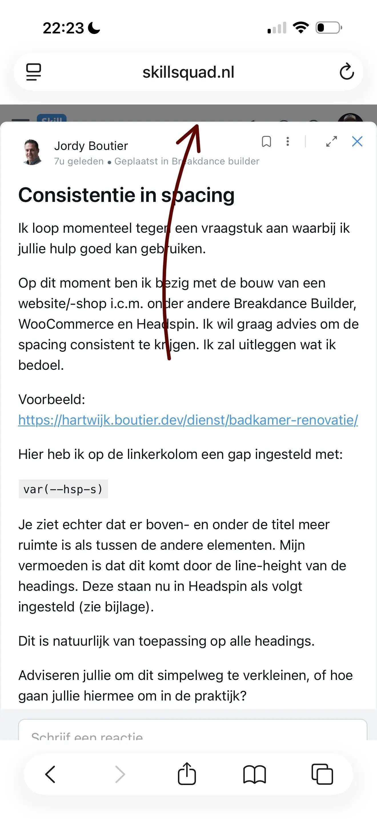
And last: the modal window has some space, about 20px on top. (See screenshot). I don’t know if this is intentional bit it would be nicer if it’s full height on mobile.
Thanks!

I think you should use it without modal, I don't use modal when viewing feed posts.

WiLson Eberechi even without modal it’s there although less. So maybe it’s not a modal issue.
Modal is better because people have to go back after viewing the post without modal.
Rob de Wit Okay, but you can write a custom CSS that portrays your taste also
WiLson Eberechi that’s true. Maybe the spacings and close icon size is a matter of taste but the ‘yanking’ isn’t imho.
It appeared that the ‘yanking’ was caused by the setting ‘sticky headers’ in the personalisation settings. Now it’s smooth scrolling from top to bottom. Yes! I’m happy now 😄