UI Improvement
Dear Fluent Dev Team: thank you for the awesome work you are doing with Sure Community Plugin. The new UI is a lot better than the previous but just like Oliver Twist, I believe a whole lot can still be improved. I will be sharing few things I noticed and feel could be improved on.
- Header Logo Customization: I am suggesting the ability to customize the logo size.
- Menu Customization and hoven effect Options: I will helping my clients build community into their WordPress Website, I will be have a level of customization that will allow me make each site look different. Ability to make top nav all caps, use hover color instead of button style hover etc. will really help.
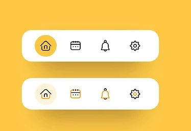
- I can see some inconsistency with some of the Icons used especially for the (Dark/Light Mode, Search, Notification and Chat) Icons. I also feel like there's no enough space between them. It will be really great if you can provide some advance level of customization for those who would love to change those Icons and add some breathing space.
- Button Style Option: I have a personal project that the current button style is perfect for. However, I have a client who will have me match the button style with that of his website. It will be awesome if you can allow us customize button style. Button radius, size and color.
Can we draw some inspiration from the Medium and other UI screenshot I attached?
Thank you