


UI fixes for mobile view
Please adjust some UI for Mobile view so it looks good:
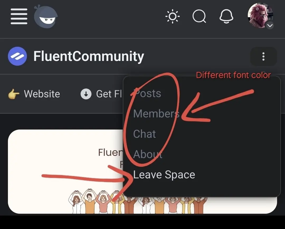
- Space kebab icon items font color has different color than the item: Leave Space
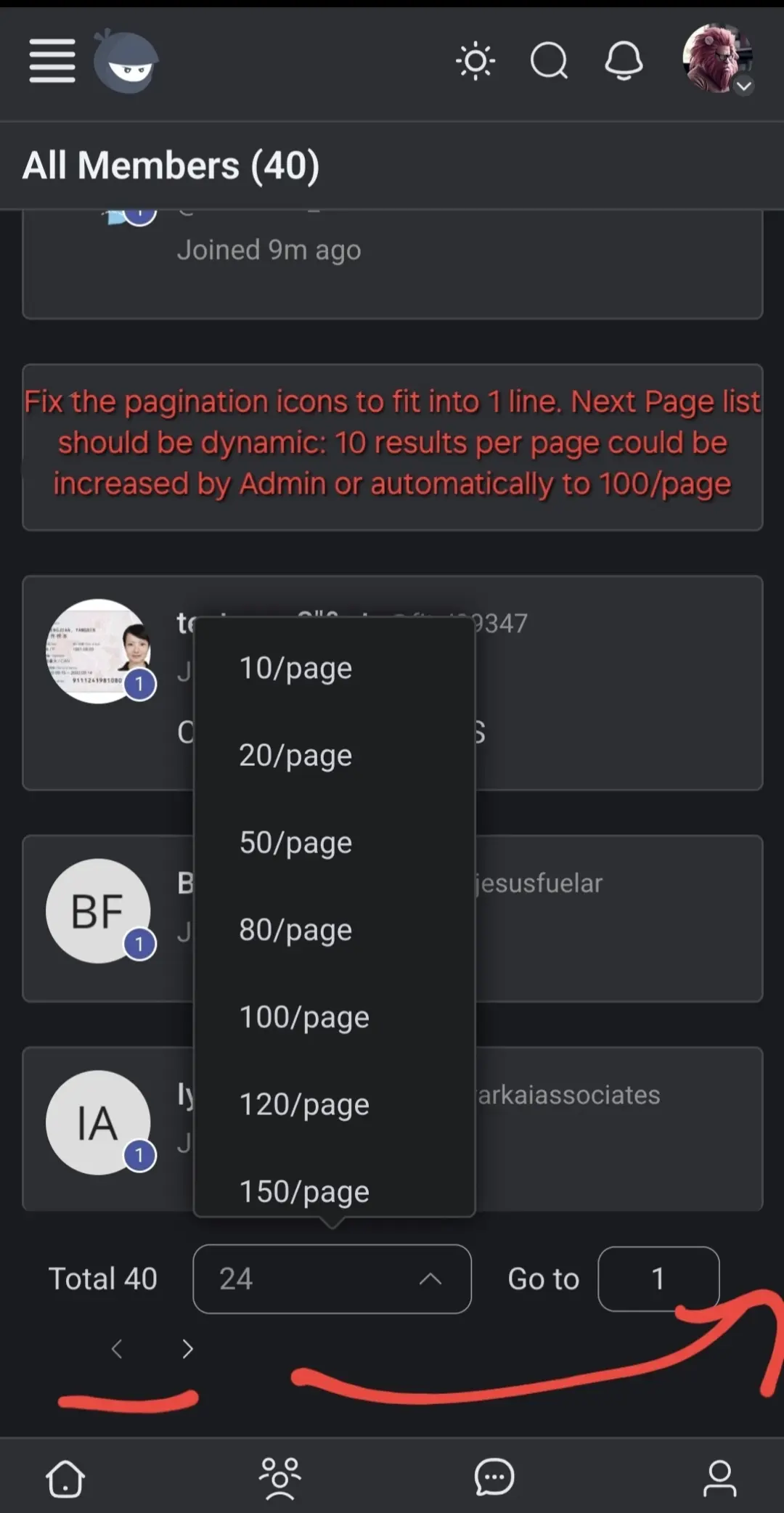
- Pagination menu is breaking into two lines (pagination icons are located in many places but the problem is the same - doesnt look tip top)
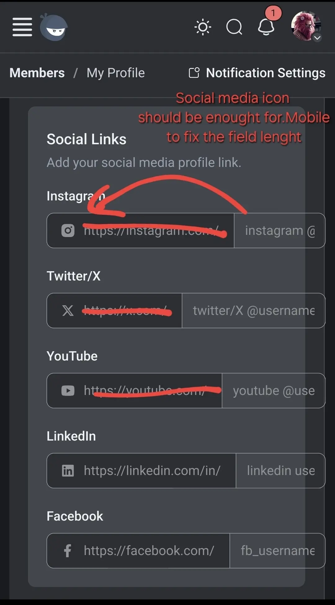
- User Profile Social media fields lenght to be fixed
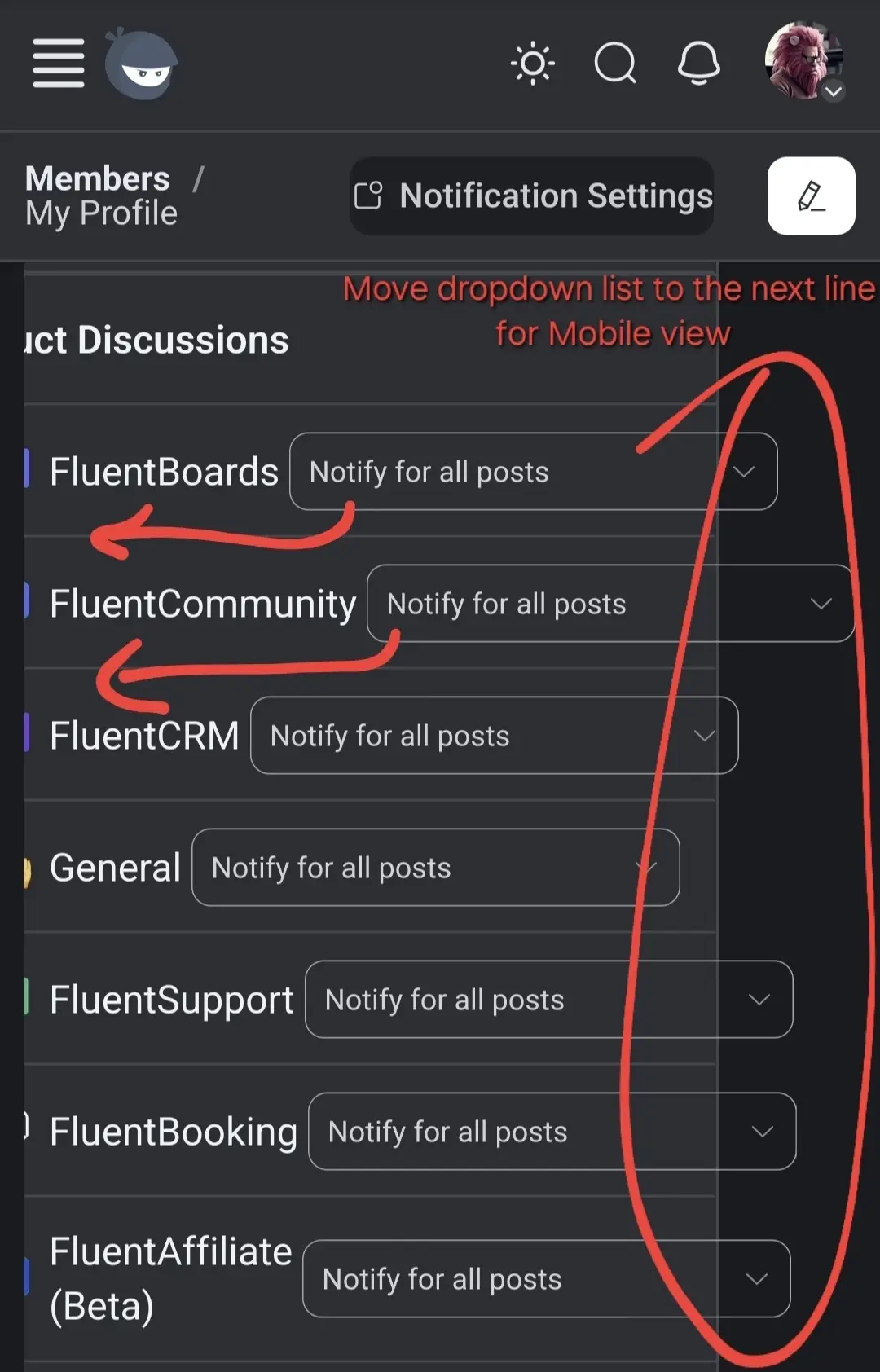
- Notifications dropdown list to be moved to the next line

Noted.

Shahjahan Jewel add the translation string for /page, please.
It is the last untranslatable string :)
Andrey Golovinov Will be done!