

Small gap
I've also noticed a new layout inconsistency that wasn't there before the update. There is now a small gap (unintended padding)
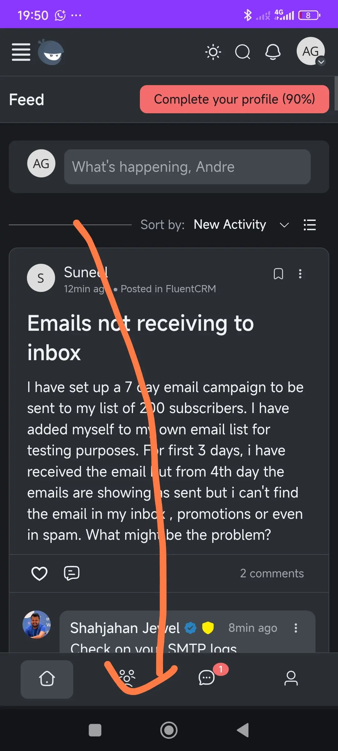

Not just this, in search form 2x clear button.

teethy, we will look into this, thank you for reporting.
Hello teethy, couldn’t recreate the issue. Shows only one clear button in the latest version. If you still persist the problem, please do let us know. Custom CSS should be checked.

Tawsif Ahmed Riyad i do have the same problem after the last update
Tawsif Ahmed Riyad maybe try android. I have same problem on opera, chrome and Firefox. Basically all browsers.

This gap is a lifesaver for mobile users it’s pretty clear and not stitching the mobile menu so close to the home buttons of our phones
Ioannis Glossopoulos, yep. Previously it was very lean, users can still use custom CSS to make any UI modifications, increase/decrease the size, padding, height according to their preferences.
Ioannis Glossopoulos honesty I hate it now. Not just gap but height. It is so height.
teethy, Andre Gois, if you guys want to revert to how it was before the release, simply use Custom CSS from Settings > Customization, save the below snippet,
.fcom_mobile_menu {
  bottom: 0 !important;
}
.fcom_mobile_menu .focm_menu_items {
  padding: 0 !important;
}
These values were changed; you guys can still get back to how it was using the above snippet, or do console debug from a web browser to change how you want, then save the CSS properties.
teethy I am using the PWA now and the height is just right and helps my people. I can’t find the search space you mentioned I can’t see it