

Simple Styling Wins (Pt. 2)
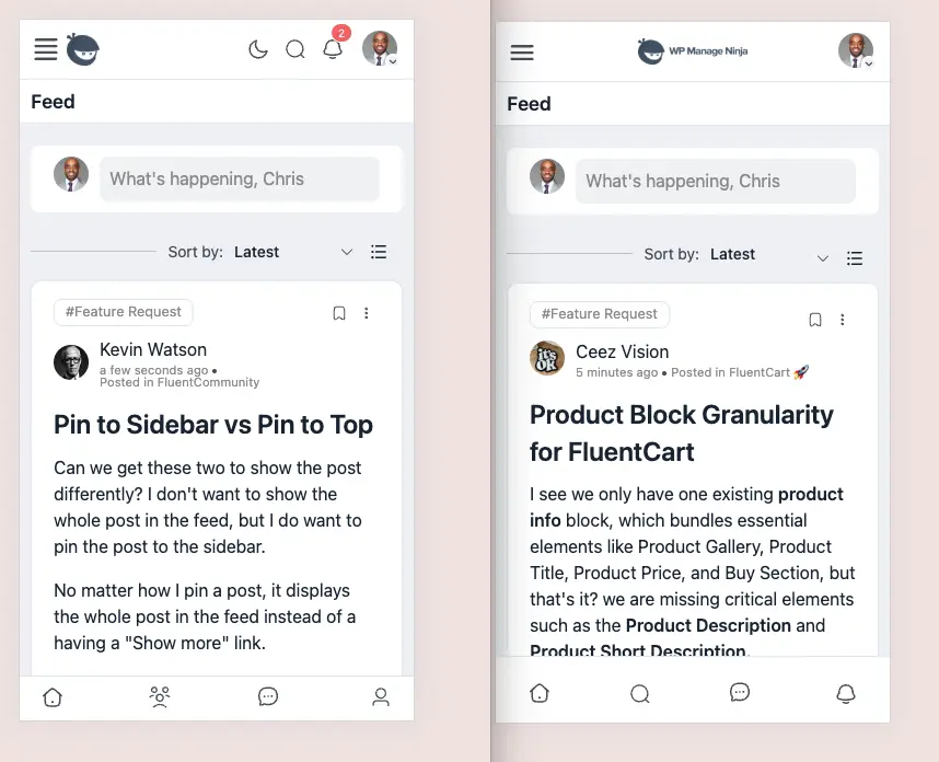
These updates are more exploratory and inspired by the clean look of Circle's platform. Interested to see if you all feel these updates clean up the presentation and make it look more polished.
- Made the hamburger menu 3 bars instead of 4
- Centered the logo. It always seems a bit off to me on mobile and imbalanced
- Moved search and notifications to the bottom navigation (profile being down there is redundant because it's in the header and felt like the spaces icon is used less than the search)
- Added spacing around the footer navigation
Had some extra time to play around and "fix" some things that have always bothered me and made the platform feel less polished and finished.
Interested in your thoughts. I have not made any of these edits permanent in my community just tested things using the browser inspector tool.

Looks great! And does seem more functional as well.

I can dig it!

Nice!

Much better


We need more easy ways to customize FC on our own if you ask me.

Wilco Wietsma that's where I'm torn. On one hand, WordPress users are used to being able to customize everything.
On the other hand, no other community software gives any level of customization besides logos, banners and button colors.
Chris Davis nodeBB allows for quite some customisation!
Wilco Wietsma let me clarify...more "mainstream" community software like Circle, Skool, MightyNetworks, etc. don't allow for much customization. These are the main competitors I see FluentCommunity competing with (and being heavily influenced by).
Of course there are all types of other softwares out there that do allow more customization but I would say they are not the most widely adopted and used by small businesses more than the ones listed above.
Either way, I agree with more customization and I'm also able to add my own customization as well.

Styling with CSS is practically universally supported though, and the main competitors of Fluent Community in WordPress are BuddyPress and BuddyBoss, which offer substantially more hooks, filters, and API endpoints for customization compared to Fluent Community still. Fluent Community is cleaner and more modern, but it has a lot of catch up in the area of customization. I would say SaaS platforms are entirely different animals that handle the entire tech stack as part of their service offerings, including hosting. Less customization opportunities is the cost of full out-of-the-box support.

Chris Davis the target audience for Circle, Skool, MightyNetworks, etc is substantially different than Fluent Community. The majority of their customers wouldn't even know what CSS means.
Elaine Montoya Agreed but I know quite a few that have left those platforms for FluentCommunity. I wouldn't sell it short. I recommend it all the time to Circle and Skool users and they're almost always impressed by the look and functionality as well as the cost.
However, I'm not sure I can confidently state who the audience truly is without asking Shahjahan Jewel to confirm (unless he has done so elsewhere that I have not seen).

I love all the changes!

Yeagh loving the changes! you probably have a clean simple home too ;)
Did you add the changes to the custom css snippets in FC? care to share them here ;)
Morgan McArthur I haven't made them permanently on a site yet. Just using the browser inspector to see what's possible. But yes, I usually move the final code into a snippet using FluentSnippets.
These type of changes I would need to do a full site test to ensure nothing else is modified or styled beyond the main feed which I will probably do at some point.
Just experimenting now.
Chris Davis oki doki... thanks for sharing your experiment with us Chris thus far ;)
Morgan McArthur you're welcome!

I love being a featured example of what not to look like haha.