

Simple Styling Wins
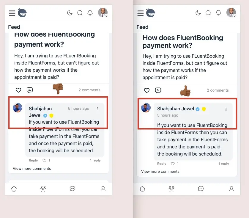
I've found that there are tons of styling opportunities within Fluent products that often times give them a less polished look and feel. One is how names are pushed to multiple lines in comments. A simple CSS update shown below makes the platform look much cleaner.
BTW, this was done with 3 lines of CSS.

Great point! If you’re open to sharing the CSS, I’d love to implement this in my community.

Kaneisha G. sure:
.each_comment .comment_text_head {flex-direction: column;}
.comment_actions {position: relative;top: -44px;height: 10px;}
Here's a quick walkthrough: https://www.loom.com/share/a551f83d80654ff9b5b6676630bf6c75
You'll probably still need to test it at various breakpoints and device widths but this works at least on mobile.
Chris Davis thank you!! I’ll try this out when I’m in front of my computer


I hope this gets picked up by the team.

Be careful,
.each_comment .comment_text_head {flex-direction: column;}
This line of code also change styling on comments tab on user profiles :)
You can use instead my code:
body:not([data-route="user_comments"]) .each_comment .comment_text_head {
flex-direction: column;
}
Drive Zone yes...please test before adding to your site. You could go the other way and qualify the CSS more so it only applies to posts in the feed as well. Many ways to achieve this if you're familiar with CSS.