

Problem with the order of open access courses and communities
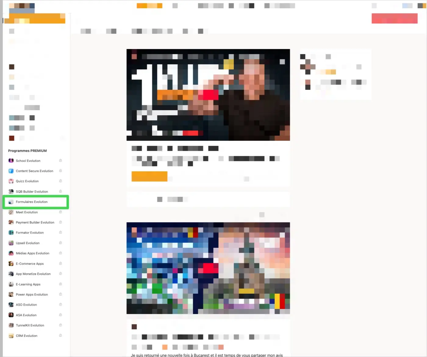
When you have a large shopping or community list, it would be nice if the open accesses were displayed first in the list. This is not intuitive at the moment because the user has difficulty finding their way around the list. If the open accesses were displayed first, it would be easier. The small missing padlock alone is not enough. Can you fix this behavior for the next update ? Thanks you. Shahjahan Jewel

Any news Shahjahan Jewel

We decided not to show any icon when users have access. If we show another icon the UI will look busy.
Shahjahan Jewel That's not the problem. It's the display order. Imagine I have 10 courses and I have access to the 10th. I have to scroll all the way down to find it. It would be more logical to see it appear at the top of the list and below those I don't have access to. Hope you understand
Dragan STAMENKOVIC We will try to give you a filter hook to re-arrange menu items.
Shahjahan Jewel Thanks. With a hook, that would be great 👍
Hi Shahjahan Jewel 👍do you have news with hook ?