

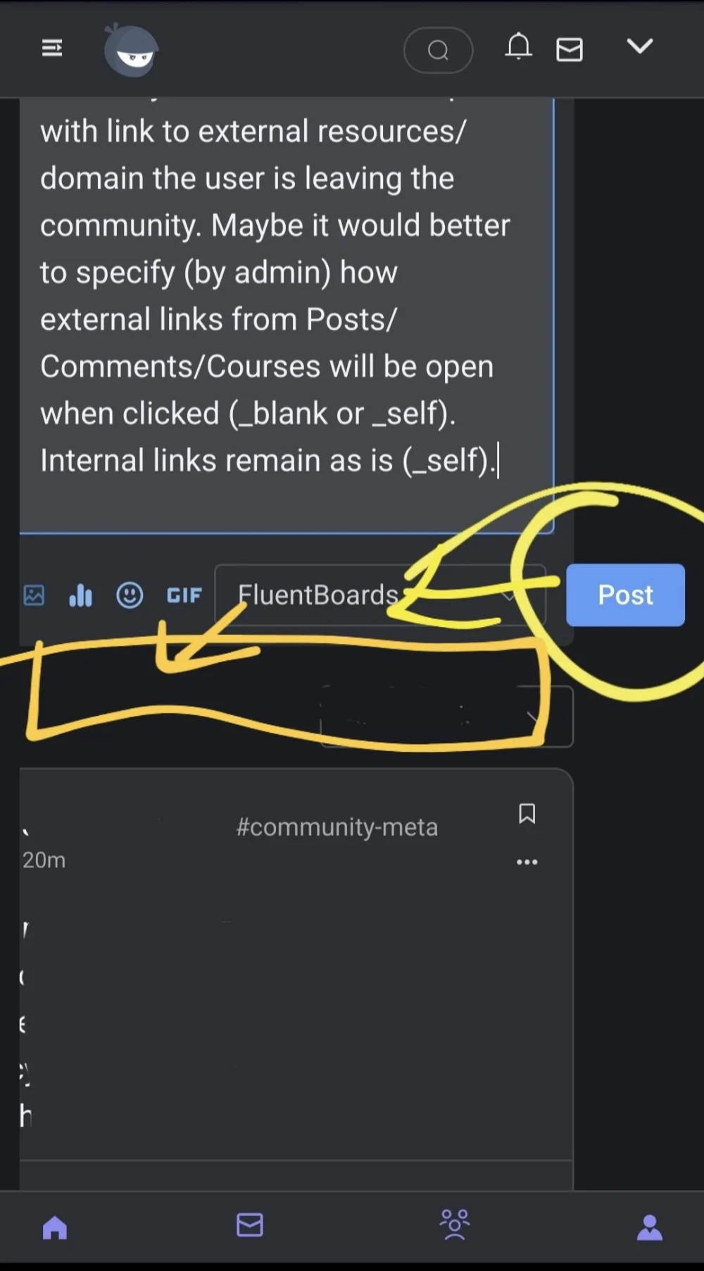
Please fix the Post button location for new posts creation for Mobile view. It is going outside - mobile view.
ps. there are many small details that could be improved for Mobile view (including Dark Mode where some elements have colors from the Light mode).
ps. option to consider: ability to move post to other Space when Editing the post (this feature can be available to all users or for the Admin/Manager). In this case the Spaces drop down list could be move down and the Post button could be moved left.

+1 same issue here.

Noted
Not Important, Fixed in the lastest release

Shahjahan Jewel, for new posts it looks like this now - if more icons will be located under the post than awesome
Not Important, A new UI us coming soon! We will handle these issues.
Shahjahan Jewel,got it