

not beautiful
the way single vertical pics are portrayed. see screenshot. horizontal pics are filled horizontally. vertical pics should be too.
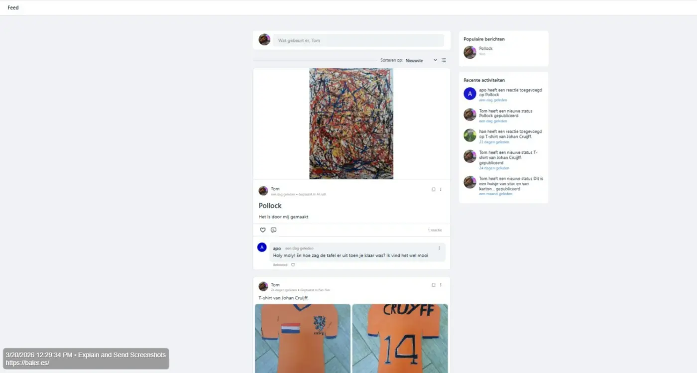


+1

How should it do it? If you expand the pic to fill the space, the post will become really tall unless you stretch the image which would make it look weird. If you zoom in on the picture to make it fill the space but not make the post really tall, you'd cut out part of the image.

Thomas Oates yes, cut a part, limit the height. we dont need to see the whole pic until clicked.
Han Van That would work but might end up with weird results depending on the picture. If they were to ever make this change, it should certainly be optional as not everyone would want pictures cropped before clicking.
Thomas Oates it is the view window of the post i am talking about, not the pic itself. fill it up with pic.
Han Van Unless I'm misunderstanding what you're saying, wouldn't the end result be the same....only part of the pic showing until you click on it? Again, that may work for some pictures but it could be bad for others.
Thomas Oates true, we will not see the whole pic. i just dont like blank spaces on social websites.

You can use Custom CSS from Settings > Customization to modify the UI as you want, you just have to go through some checks from the browser console, and use your desired CSS properties in the targeted classes and get the UI view as you want.
Tawsif Ahmed Riyad this worked for me:
.feed_media_image img {object-fit: cover !important;}
Han Van, that’s how it is, FluentCommunity allows users to customize UI in many ways, Settings > Customization > Custom CSS is one of them.
Tawsif Ahmed Riyad yes, but i needed the pro version for that.

Han Van yes. But you are lucky: they sell it to you gladly! 😊

Anne-Sophie W did you put it in the FC portal settings?