


👀 Introduces visual hierarchy
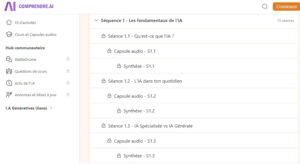
I’d like to suggest a UI tweak that introduces visual hierarchy within FC. Right now, all sessions appear in a single flat list, making it hard to see which items are “sub-sessions.” If we could offset or indent child sessions under their parent, users would immediately grasp the course structure—and navigation would feel far more intuitive. Naturally, this change must not interfere with existing navigation controls or the Next/Previous buttons.

✅✅✅