


#Featurerequest: Better text contrast in dark mode.
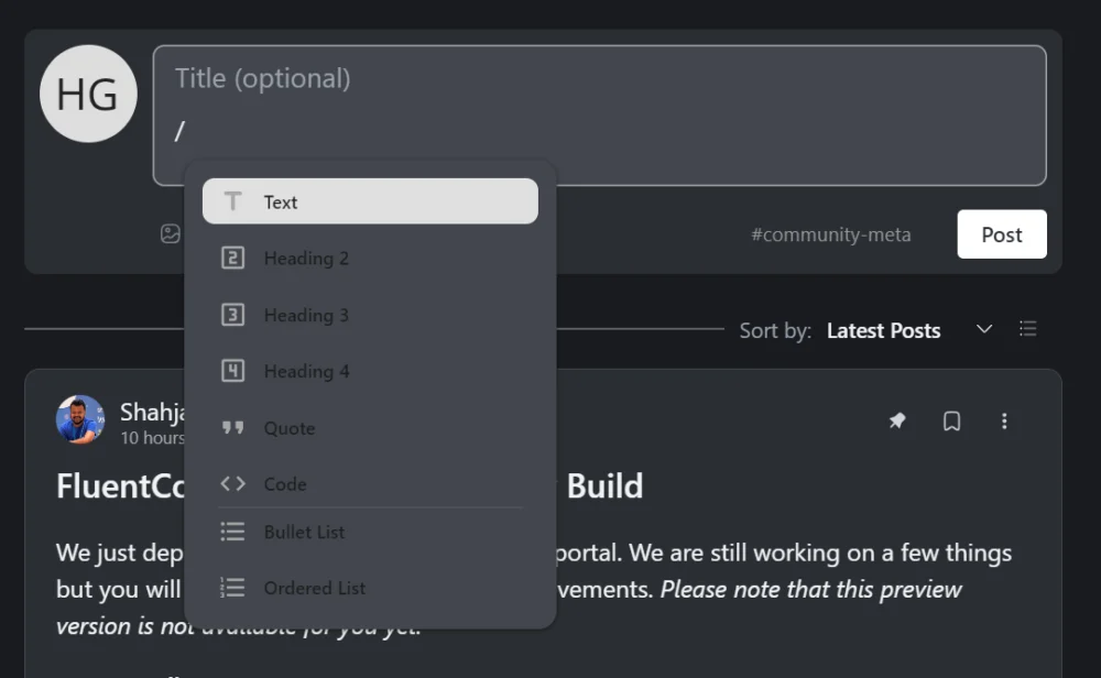
I just tried the / (content type) feature, in the new UI, and in dark mode I think we need beter contrast on the text menu items.
Its kind of hard to read the dark text of the menu items.
#Featurerequest #UI #UX

Shahjahan Jewel , is it possible to translate the items in this menu?

Fixed the color issues on our dev branch and also those labels can be translated now.