

fCommunity suggestions lists:
-
Implement tooltips/hints when pointing mouse over icons it the top header naviation bar (Mobile view tooltips might be a challenging but for Desktop view are needed).
It is obvious that once a end-user has some experiance with fCommunity it is easy to navigate but for better user experiance it is good to have tooltips for even all icon or Top/Left pane menu items.
Even hover mouse on top header logo should give user some hints what he can expect once he click it (tooltip: "Go to Portal starting website" etc).
All tooltips should be somehow translateable or even customized at some point.Example icons tooltips description:
- Ringbell icon: "preview notifications for new Spaces messages"
- Envelop icon: "create or check your private messages (PMs)"
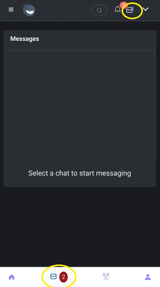
BTW: for Mobile View the Envelop icon in the header is duplicated with the footer navigation menu - the top envelop icon could be removed for Mobile view to save some space.
-
Fix the tooltip notification for mobile view so the tooltip disspears after x seconds or even the tooltip is not visible to a Mobile user (this preference also could be configurable).
Currently if user is working on Mobile (but Desktop view too) in fCommunity and a new notification popuping up then he needs to click the tooltip (blue color) to disapear.
If Spaces communicaation will be very active such a tooltip notification might be annoying to a Mobile user. -
User picture icon is visible in a Header section but also DownArrow icon include View Profile link.
Maybe instead of DownArrow icon we could have User Profile Picture gravatar only - once it is clicked the menu is opened and View Profile item/link is available on that list. -
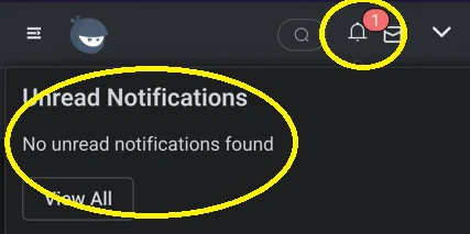
There is an issue with new post Notification Icon in the header. Sometimes even if you read all notifications the icon show how many new notifications you had. Once you refresh the screen (F5) the number is gone. But when all notifications were read after x seconds the Red Indicator with number of notification should disapeared.
-
Please fix the formatting for new PMs number - on Mobile it is overfloating.
Also new PMs number text is not formatted the same way as the number for new notifications (red circle icon with number). -
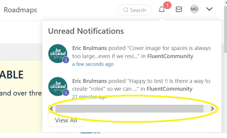
Horizontal scroll visible for Unread Notifications - not sure if this is because my laptop resolution or just post text description in the notification is too long


add button: Mark All as Read directly on the Popup window but also in the All Notification area allow user to Select notifications and only them mark as Read/Unread.