Dark Mode Issue with iFrame
Team,
I'd like to bring this issue (possibly a bug) to your attention regarding the dark mode on the Fluent Community platform.
Have a look at these 4 images.
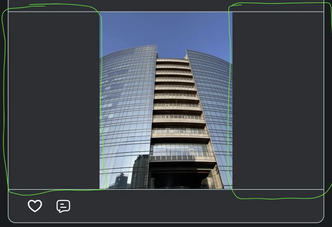
The first one shows a post with a vertical photo, published with the platform's native "image" feature. Here, as you can see, the post displays the correct "dark" bands (as per the dark mode template), which I highlighted/circled in green.
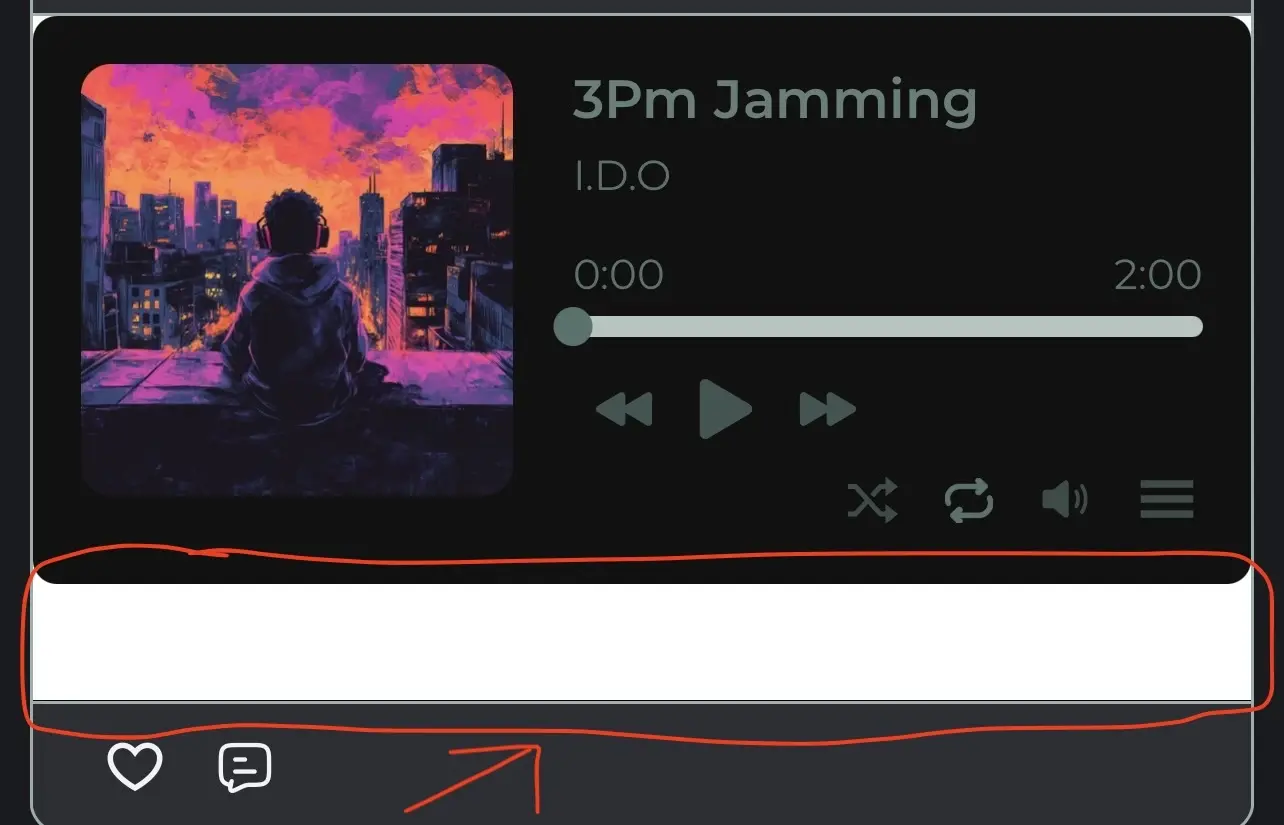
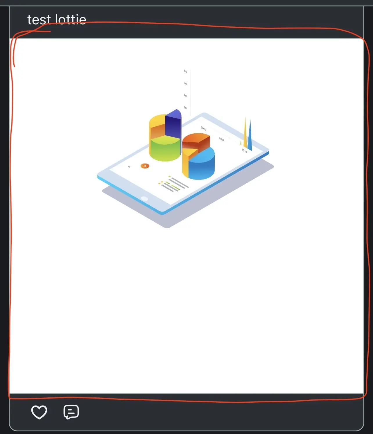
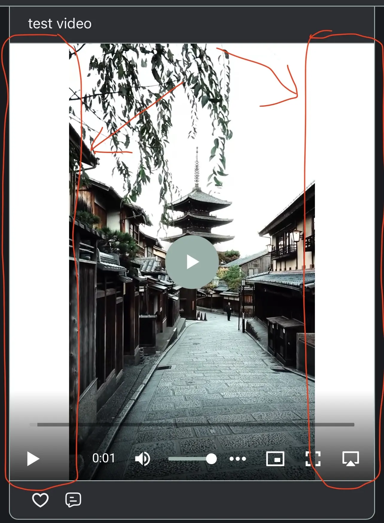
However, have also a look at the other three images. These were all published via the iFrame feature (one is a portrait video hosted on bunny.net, one is an embeddable audio player, and the last one is a lottie animation. Logic dictates that all of these should showcase/display the correct "dark mode" bands on the sides, but also above and below the embedded iFrame elements (i.e. as dark-grey background).
But what's happening is different: they feature white bands/background, as circled/highlighted in red in my examples (maybe that's something "inherited" from the light mode normal behaviour, hence a bug when using the iFrame feature?).
Please note that the original embedded element(s) background is NOT white, but transparent.
The question is: is this intentional? If not, for consistency and aesthetics, can this be amended so that the background outside/around any embedded iFrame elements is the correct dark-grey colour (when in "dark mode", of course)?