

CSS styling issues on mobile devices
There are some styling issues on mobiles, FC anyway need some optimization on mobiles, I did a lot by myself but it can be fixed natively not via snippets and fixes by FC customers.
Screenshots:
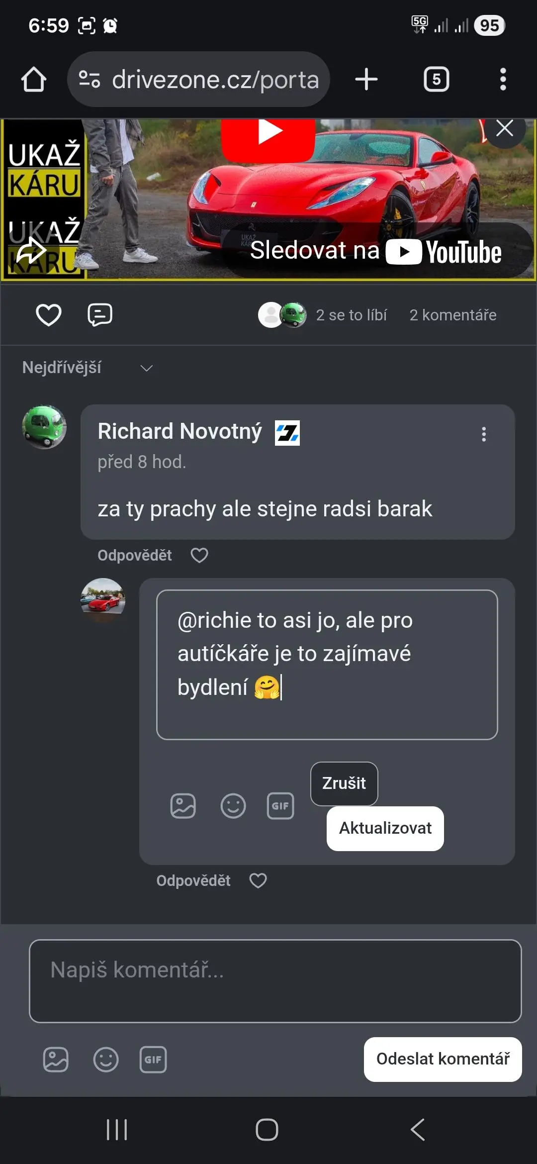
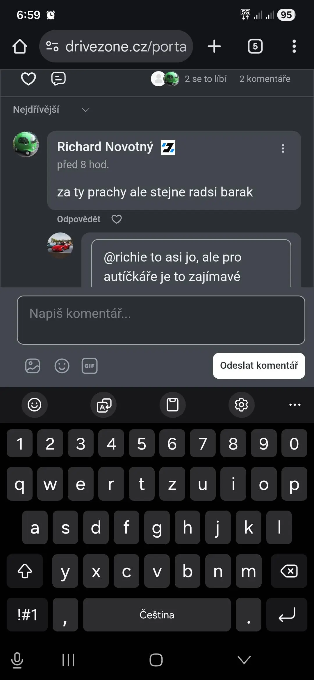
- edit reply on someones reply = messed buttons
- when you want edit your reply to someones reply comment, it scrolls on first reply comment, but when keyboard appear, Cancel & Update buttons are overlayed by keyboard. To me also often happen in that case that I edit / make changes to my reply I mistakenly click button which is for new comment and not for update because it is hidden behind keyboard.
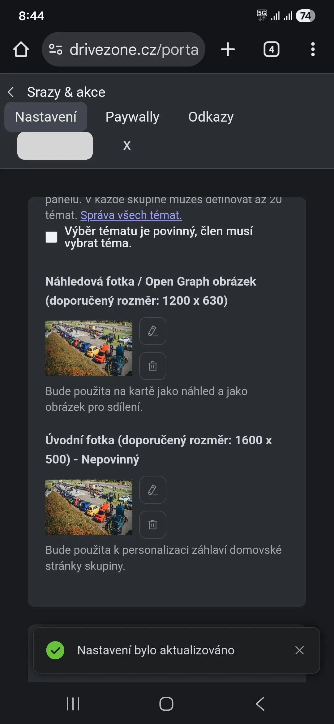
- messed buttons in space settings, dont mind color of button, just alignment could be better
These buttons alignment issues are on mobiles pretty often. Since 70% of users use mobile devices, it should be optimization-first to do...

Yep.. thanks for the reminder.. mobile first

There is also so much left/right padding. Most of the text is long and narrow.

Thanks for reporting, will look into this matter.

Tawsif Ahmed Riyad also typical problem, emoji picker window hidden somewhere. Sometimes can help scroll up and down but it is annoying.

Drive Zone Hello it's not related to your question but I often notice this loading G-Translate icon on your site. It's a problem from G-Translate? No way to avoid it?
Drive Zone BTW why you decided to relaunch a set of new frames when you click on "shop" or "donate"? Why don't you launch the 2 pages within FC frameset?
Prosper probably because of detection browser language. My site it not ready for international visitors yet.
Prosper What do you mean by that?
Drive Zone I noticed that when you click on shop or donate you go there:
https://drivezone.cz/shop/
https://drivezone.cz/donate
And you created new pages similar to classic FC with similar icons. But why don't you used internal links? Something like https://drivezone.cz/portal/shop
Or https://drivezone.cz/portal/donate
I was curious to understand why you preferred to do that
Prosper because these pages are not part of Fluent Community because they are wordpress pages. I had site running on Buddyboss and changing all permalinks to contain /portal/ means a lot of reindexing because they are already indexed by google. All wordpress pages are rendered in Fluent Community frame via php snippet but they are not part of FC.
Drive Zone thanks. And I also discovered now that it's impossible to add a link in the left menu or in the header menu without opening a new link. . I would like that when I add a link (a static web page) in the top menu or in the left menu, it displays within FC instead of opening a new page. Your solution is a workaround for this problem?
Prosper Not sure if I understand you, you mean you want WP links open inside of portal? If yes take a look here: https://fluentcommunity.co/docs/theme-compatibility-feature/
Drive Zone Great thanks a lot! Exactly that